Courses
Course webpages served on MapAspectsGIS and Anthropology
GIS and Anthropology
This course is on the subject of GIS applications in anthropology and archaeology.
Note this material is for a UCSB course from 2006. I've since taught a semester-long class "Geospatial Archaeology" for UC Berkeley Anthropology in Spring 2015 and I recommend following the link to the newer course content (Open Access) rather than continuing on this frozen archived page
Please use this updated version of the course!
GIS and Anthropology - Fall 2006 Syllabus
Anth 197: GIS in Anthropology -- Fall 2006
Nicholas Tripcevich
University of California, Santa Barbara
"Geospatial Archaeology"
that I taught for UC Berkeley Anthropology Spring 2015.
https://bcourses.berkeley.edu/courses/1289761.
Course description: This class aims to provide the theoretical and methodological background for proficient use of GIS in anthropological research contexts with a focus on archaeological applications. As geospatial technologies have also become pervasive tools for data organization and for communication, this class will focus on teaching through hands-on experience with acquiring and managing data, analysis, and map production. There is a great deal we cannot cover in a ten week quarter, and so in the lab assignments the aim is to learn problem-solving skills and common research tools in GIS.
Meeting times: Class will be held on Mondays from 2 – 4:30pm. We will meet in the classroom in HSSB 2001a and in the large room of the LSIT computer lab in HSSB 1203. My office hours are Monday 4:30 – 6 pm in the same lab space (HSSB 1203), and Thursday 1-2:30 pm in the lab room. Please get your labs started early so that you can catch me during office hours for any help you might need.
Assignments and Grading: The course outline and reading assignments are listed below. The course will be organized around labs and the development of a dataset for a study area that becomes your final project. There will also be a midterm paper consisting of a 5 page paper in the form of a proposal for GIS-based research, and students will present a 10 minute summary of a case-study I have listed on a longer bibliography posted on the class website.
Your grade in the course will be weighted as follows:
- 10% - Short in class presentation and class/web participation
- 20% - Lab assignments
- 30% - Midterm
- 40% - Final project
Software: This course is based on the ESRI ArcGIS 9 suite of software. For data manipulation and statistical analyses outside of ArcGIS we will use Microsoft Access and JMP 5.1. Additional web-based tools and presentation media will be involved.
USB pen drive required: No data can be stored on the computers in the LSIT lab as new files are deleted whenever the machines reboot. We must store our data on USB drives and everyone is required to have one (256Mb or larger) for the class. Online USB 2 drives are $25 shipped (512mb model at Amazon), so they have become relatively affordable.
Readings: Required readings need to be done before class.
Required text: Wheatley, David and Mark Gillings (2002). Spatial Technology and Archaeology. Taylor & Francis, New York .
Additional readings will be photocopies primarily from the following books:
Aldenderfer, Mark and Herbert D.G. Maschner, editors (1996). Anthropology, Space, and Geographic Information Systems. Oxford University Press, Oxford.
Connolly, James and Mark Lake (2006). Geographical Information Systems in Archaeology. Manuals in Archaeology. Cambridge University Press, Cambridge, UK.
Goodchild, Michael F., and Donald G. Janelle (2004). Spatially integrated social science. Oxford: Oxford University Press.
Lock, Gary R., editor (2000). Beyond the map: Archaeology and spatial technologies. IOS Press, Washington, DC
Westcott, Konnie L. and R. Joe Brannon, editors (2000). Practical Applications of GIS for Archaeologists: a Predictive Modeling Toolkit. Taylor & Francis, N.Y.
Course Outline and Required Reading Assignments
Week 1 – Course introduction, general discussion and lab work.
Week 2 – GIS organization and output - Lab 1 due.
Readings for class during week 2: Wheatley, D., and M. Gillings (2002). Spatial technology and archaeology: the archaeological applications of GIS. London: Taylor & Francis, Ch. 1.
Connolly, J., and M. Lake (2006). Geographical Information Systems in Archaeology. Manuals in Archaeology. Cambridge, UK: Cambridge University Press, Ch 2.
Goodchild, M. (2005). Geographic information systems. In Encyclopedia of Social Measurement 2: 107–113.
Editing in ArcMap, (2004), ESRI Press, Ch2.
Week 3 – New data acquisition and input methods.
Readings: Wheatley and Gillings (2002), Ch 2 and Ch 3.
Ur , Jason (2006), Google Earth and Archaeology. Archaeological Record 6(3):35-38.
McPherron and Dibble (2002), Using computers in archaeology: A practical guide. Boston: McGraw-Hill. pp. 54-64 (Intro to GPS).
Week 4 – Thematic maps, buffers, and overlays – Lab 2 due.
Readings : Wheatley and Gillings (2002), Ch 4, Ch 6, and pp 147-149.
Using ArcMap (2004) ESRI Press, Ch 1.
Week 5 – Rasters, surfaces, and continuous data
Readings : Wheatley and Gillings (2002), Ch 5.
Tobler (1979). A Transformational View of Cartography. American Cartographer 6:101-106.
Kvamme (1998). "Spatial structure in mass debitage scatters" in Surface Archaeology. Edited by Sullivan, pp. 127-141. Albuquerque: UNM Press.
Modeling our World (2002), ESRI Press, pp147-160.
Week 6 – Midterm. Demography, community mapping, and management.
Readings : Goodchild and Janelle (2004). "Thinking spatially in the social sciences," in Spatially integrated social science. Edited by Goodchild and Janelle, pp. 3-22. Oxford: OUP.
Weeks, J. R. (2004). "The role of spatial analysis in demographic research," in Spatially integrated social science. Edited by Goodchild and Janelle, pp. 381-399. Oxford: OUP.
Aswani and Lauer (2006). Incorporating fishermen’s local knowledge and behavior into Geographical Information Systems (GIS) for designing marine protected areas in Oceania. Human Organization 65:81-102.
Week 7 – Quantifying patterns I – Lab 3 due.
Readings : Wheatley and Gillings (2002), Ch 6 and Ch 11.
Week 8 – Locational modeling.
Readings : Wheatley and Gillings (2002), Ch 7 and Ch 8.
Wescott, K., and J. A. Kuiper (2000). "Using a GIS to model prehistoric site distributions in the upper Chesapeake Bay," in Practical applications of GIS for archaeologists. Edited by K. Wescott and R. J. Brandon, pp. 59-72. London: Taylor and Francis.
Ebert, J. I. (2000). "The State of the Art in ‘Inductive’ Predictive Modeling" in Practical applications of GIS for archaeologists. Edited by K. Wescott and R. J. Brandon, pp. 59-72. London: Taylor and Francis.
Week 9 – Cost-surfaces and viewshed analysis – Lab 4 due.
Readings : Wheatley and Gillings (2002), C 10.
Tschan, André P., Wldozimierz Raczkowski and Malgorzata Latalowa (2000). Perception and viewsheds: Are they mutually exclusive? In Beyond the map: Archaeology and spatial technologies, edited by Gary R. Lock, pp. 28-48. IOS Press, Amsterdam.
Van Leusen, P. M. (2002). Methodological Investigations into the Formation and Interpretation of Spatial Patterns in Archaeological Landscapes, Ch. 6.
Week 10 – Interpolation and kriging
Readings : Wheatley and Gillings (2002), Ch 9.
Final projects due on the day of the final on Tues, December 12, 4pm.
Weekly In-Class Exercises
Exercises completed during class and lab hours.
See newer versions of these workshops here: Geospatial Archaeology, spring 2015
Week 1 - Introduction to ArcGIS and acquiring new data
Classroom topics:
- Structure of the class.
- Introduction to GIS
- Applications in anthropology
- Strengths, weaknesses, and critiques
- Topics we will cover in this 10 week course
In Class Lab -- Week 1
Part I - Create a shapefile and digitize from a satellite image.
In this exercise we will learn how to create a polygon shapefile by digitizing the polygon from an satellite image of the pyramids of Giza.
- We will begin by downloading files from the class download directory. Download Giza_image.zip and pyramids.zip.
- Go to ArcCatalog and create a folder called "Giza". In that folder, create a polygon shapefile with one Text string attribute field called 'Title'.
- Unzip and add the "Giza_image" jpeg to an Arcmap project.
- Digitize two of the pyramids as polygons by starting an edit session. Once you have drawn them, open the attribute table and name these pyramids "Pyramid 1" and "2" in the Title Field. Change the symbology to hollow red shapes and label the shapes using the Title field.
- You've just done "heads up digitizing" on a satellite image.
Part II - How to import point locations from an XY table.
- In Part I you downloaded a CSV file called Pyramids.csv. These are data I got from a GoogleEarth blog site showing the locations of many pyramids in Egypt and a few in the Americas. Double-click the table file in Windows so you can view it in Excel. Note that the first line, which become field headings, consist of simple and short words. The table was Comma-delimited format (.CSV = comma-separated variables).
- Import the CSV file into Arcmap using the "Add XY..." command. As you saw, there is the Name column, and then coordinates in Latitude and Longitude and decimal degrees. Which column of values do you think goes in the X column and which goes in Y? Make sure that the data is assigned to the Geographic "WGS1984" coordinate system.
- The file is imported as an "event theme". You should see the points fall right where the pyramids that we digitized are located. If the new points don't fall within the polygons you digitized then there's a problem... maybe you needed to import Longitude as the X value and Latitude as the Y value?
- We want to convert these data to a regular point Shapefile. Make sure no features are selected, and then right click the layer and choose "Export Data..." to convert these data to shapefile. Remove the original Events layer from the Table of Contents. Load the new data into your view (and remove the Events theme). Label these points by right-clicking the new Shapefile data layer in Arcmap and choosing "Label features".
You just brought in raw point data from an XY text table. This is a very powerful technique for importing raw data tables from books, data sets online, and a variety of input tools like GPS units, total stations, laser transits.
Part III - In which countries are these pyramids found?
- To answer this question we need to download some reference datasets. Go to this data folder http://www.mapaspects.org/gis/data/ and go to /vectors/world/ and download "Admin_boundaries2004.zip" to your work space. These are data showing National and State (Provincial) level regions in a WGS1984, Decimal Degree reference system.
- Unzip and this folder and add these data to your view. Drag the Admin layer to the bottom of the Table of Contents so that these large polygons don't obscure the other layers.
- By using a spatial join we can have the attributes of the Admin layer appended to the Pyramids layer. Right click "Pyramids" shapefile point layer and go to Join... and then at the top of the Join box choose the box to Join using spatial location. Join to the Admin layer and call the output file "Pyramids_Admin".
- Open the attribute table of the resulting file. Note that the 38 rows of pyramid data now have Admin table data appended to the right. Scroll right to see these data. Sort the table by Country by right-clicking the CNTRY_NAME field and choosing Sort Ascending.
- How many pyramids are in each Administrative area? This question is answered easily by right-clicking the ADMIN_NAME field title and choosing "Summarize...". At the bottom of the dialog name the file "Admin_Pyramids_Table". The output appears in your table of contents. There should be four rows (admin areas with pyramids) and the COUNT of pyramids in each zone. Here we found that using generic administrative data can be useful in a number of ways.
- you can use it to visually confirm that your data lines up with other "objective" data from other sources.
- you can use it to compare your own datasets with familiar administrative categories for reports and other summary functions.
As you can see a powerful part of GIS is the ability to combine tabular data with geographical location. The Spatial Join function is very useful for combining datasets that are not otherwise compatible because they use different indexing systems or naming conventions, or they are in different languages. The common reference of spatial position brings them together.
Homework from Week 1 Notes
THIS PAGE CONTAINS NOTES ABOUT HOMEWORK FOR WEEK 1 Assignment The UCSB Geography 176b class has a nice, brief tour of Arcmap as their first exercise. With their permission, I am assigning this as our first lab as well. Please complete Lab 1 - Intro to ArcGIS from the Geog176b lab page and turn it in at the beginning of class next week. Notes of about lab-
The beginning the lab concerns printing and computer use in the geography lab. These are not relevant to our class, so scroll down to "Copying Data", below these initial passages.
There are questions in orange boxes on the tutorial. Please consider the questions but you do not have to answer the questions in your lab. You might write out the answer to these questions in your notes.
The assignment involves a Word document and a map, described in green box at the bottom of the webpage.
NOTES 1. Unzipping There are a lot of different file formats in this tutorial so make sure you Unzip them all into a single folder so that there's no confusion. If you let them get scattered on the desktop you may have trouble finding them. 2. Connecting to your Data This is an important point because we will be working from a USB key so use this tool to make a direct connection to your USB key which may be drive D: or E: . 3. Producing a PDF if you're exporting to PDF you may find that symbols like the North Arrow are not represented properly in the output. Before saving the PDF click the Format tab and check "Embed document fonts".
Week 2 - Data organization and management
Exercises:
Classroom Topics
This week's class will focus on data organization and management for GIS applications to anthropological research. Specifically, we will spend time discussing the importance of relational databases and means of organizing and querying data organized into related tables.
I will also describe approaches to indexing data for anthropological fieldwork. The ID number system at various spatial scales and methods for linking tables between ID number series.
In Class Lab Exercises, week 2
In lab this week we will focus on a-spatial data management techniques in ArcGIS. Joining and relating tables is are powerful tools, but it also creates a structure that can make queries and representation more difficult.
Download Callalli Geodatabase.
Look the data in Arcmap.
- There are a few major file groups: Ceramics, Lithics, Sites
- What is the function of these fields: ArchID, CatID, LocusID, SiteID
Display. Turn off ArchID_centroids.
- show sites as tan, ceramics as red, lithics as lt green. Orange circles = sherds, green triangles = points.
- hydrology = blue. Lg river, small river.
Discuss file formats: coverages, shapefiles, GDB. Raster / GRID.
Problem 1:
Ceramics Lab results. Cleaning up the database logic.
Working at the artifact level of analysis the ID number system is problematic because you cannot refer to a single artifact from an index field.
What are some solutions?
1. Open the Ceramics_Lab2 attribute table.
- Click Add field… in the menu below.
- Create a Long Integer field and call it “ArchCat”. Make a second one called “ArchCat_temp”
- Do you see both ArchCat fields in the table? Scroll to the right.
- Make sure no rows are selected before the next step
- Right click the “ArchCat_temp” field title column
- Choose “Calculate Values…” in the menu.
- Multiply the contents of ArchID by 1000 into this field.
- Right click the “ArchCat” field title column
- Choose “Calculate Values…” in the menu.
- Add the contents of “CatID” to “ArchCat_temp” into this field.
Do you now have a six digit ID#? That’s your new unique ID number that allows you to refer to individual artifacts.
2. Cut off the “diameter” measure for more efficient design
This is somewhat extreme "database normalization", but you can see the principal behind it.
- Right click the Diameter column and sort Descending.
- Select in blue the rows with values > 0
- Click Export… and save to a new table called Rim_Diameters
- Look at the new table. Where is your ArchCat field? It’s back on the right side. The goal here is to have a very efficient database structure with little redundancy and minimal empty cells.
- Open the toolbox (red toolbox in the top toolbar) and go to Data Management Tools > Fields > Delete Fields…
- Choose the RimDiameters table.
- Select All, then uncheck “Diameters” and “ArchCat” (at the end of the list).
- Go to the Ceramics_Lab2 table and delete the Diameters field.
- Right click the Ceramics_Lab2 table and click “Joins and Relates… > Join” and join the table to Ceramics table to the RimDiameters table. Think about the fields that you will use to join. Is this a One-One or a One-Many link?
Other selection methods. Try selecting data in the Ceram_p (not the lab file) file using Select by Attributes. The text you enter in the box is a modified SQL query. Try to select all of the Bowls from the LIP period and look at the selection on the map.
Problem 2:
Show relationship between size the archaeological site (m2) and proportion of obsidian artifacts in the lab2 analysis.
The basic problem here is that there are MANY fields in each site. In order to represent the data on the many site we need to collapse the contents of the Many table into units so the One table can symbolize it.
Steps:
1. Problem. You’ve explored the data in Site_A and in Lithics_Lab1 and you recognize that you have to collapse the values in Lithics_Lab1 before you can show them on the map. You can collapse table values with a tool called Pivot Tables and then by Summarizing on the SiteID column.
First, make sure there are no row selected in the "Lithics_Lab1" table.
Open the Pivot Tables function in the toolbox under Data Management > Tables > Pivot Tables
2. Pivoting the data table. In the Pivot Tables box select “Lithics_Lab1” as your pivot table. This is the table that has the quantity of data we want to reduce. We are effectively swapping the rows and columns in the original table.
- Click in the Input fields box and read the Help on the right (click Show Help button if it’s not on).
- “Define records to be included in the pivot table”. Think about this… we can only link these lab results to space if we can tie them to spatial units. Space, in this exercise, is defined by SITE areas. Therefore we ONLY want to deal with data in terms of the site that falls into. If you have records logged by other criteria other (too many boxes checked) you would have too many rows in your pivot table and it will not mesh with the Site_A feature. Therefore select only SITEID.
- Click in the Pivot Field box and read the help. “Generate names of the new fields”. Fields are columns in tables therefore you are choosing the field that will become your column headings. We are trying to distinguish Obsidian from non-obsidian therefore pick MATERIAL.
- Click in the Value field and read the help. “Populate the new fields”. In other words this is the value be summed for each site per material type. Chose Peso_Orig (spanish for Weight, measured in grams).
- The result should include the following: for each site with obsidian or non-obsidian we will add report the weight of each material in separate columns that can easily be summed.
You can use the default filename. It should end up in your geodatabase. Have a look at the contents of the output table. Note that there many SITEID values that are NULL. That is because there were artifacts collected outside of sites in some cases. Note, also that the MATERIAL TYPE values have become column headings (Obs, NotObs), but there are still duplicate sites in rows as you can see in the SITEID column.
- We need to Summarize by the SITEID column in order to collapse these into a single line per Site. right-click the title and go to Summarize on SITEID.
- Next, check sum in "Obsidian" and check sum in "Not Obsidian". Name the table "Obsidian_by_Site".
Look at the resulting table. Is there only one SITEID value per row? Why are there so many with a <NULL> SITEID value? Where did that data come from?
3. Representing the data. Now that the results for each site is found on a single line you can Join it to the Site_A feature.
- Right-Click the Sites_A feature and go down to Joins and Relates… and choose Join…
- Make sure the top field is for “Attributes from a Table”. Then jump down to the #2 question in the middle and choose your output Pivot Table from Step 2. Next, select the appropriate fields in fields #1 and #3 on which to base a join. You should be able to join ARCHID in the Site table with SITEID in the pivot table.
- Click “Advanced…” and read the different descriptions. This distinction is also known as the “Outer Join” vs “Inner Join” relationship. Choose “matching records” (i.e., inner join, or exclusive rather than inclusive join).
Look at the resulting table. Does it contain all the information you need collapsed onto rows? Look at the number of records. There were 88 in the original Site_A table, now there are fewer (or there will be if you update by scrolling down the table). Why is that? The original question asked about the relationship between site size and presence of obsidian. How are you going to measure site size?
4. Symbolizing the data. You can show these data using a number of tools. For example, for a simple map you could divide the weight of obsidian by the weight of non-obsidian per site and symbolize by the ratio of obsidian over non-obsidian.
Here, we will do something slightly more complex and use a pie chart to show the relationship with respect to size.
- Go to Sites > Properties > Symbology…
- Choose Show > Charts… > Pie
- Choose the bottom two fields on the Field Selection and click the right arrow.
- Change the colors of the two fields you selected to two contrasting fields.
- Click OK and look at the result.
- What about the size of the site? Click Site_A Properties > Symbolize … again
- Click the Size… button at the bottom center. Choose “Vary size using a Field…” and choose “Shape_Area” as the Size.. field and “Log” as the Normalize field.
Zoom in and out and notice how the symbols change as you pan around. Zoom way in. It looks better that way, doesn't it?
Experiment with other ways of symbolizing these data.
Save this project, we will work on it more later.
Homework
As mentioned in class, next week we will focus on methods of bringing data into GIS. Which project area do you plan to work in? We will begin constructing acquiring data (imagery and topographic data) next week so please decide on a project area by then.
You will need Latitude/Longitude coordinates in WGS1984 for the four corners of a bounding box around your study area. An easy way to get these values in in GoogleEarth. You'll want to pick a region about the size of a County in the US for this assignment.
Write down these four corner coordinate values. We'll use them in class next week.
Week 3 - Acquisition of digital data
Exercises: finding datasets, global coverage:
- Georeferencing scanned historic maps
-
Importing GoogleEarth imagery to Arcmap
- Locating topographic data
- Locating multispectral imagery
- Locating vector data
Classroom Topic:
Data acquisition methods for anthropological research.
Exercises: finding datasets, global coverage:
- Georeferencing scanned historic maps
-
Importing GoogleEarth imagery to Arcmap
- Locating topographic data
- Locating multispectral imagery
- Locating vector data
Classroom Topic:
Data acquisition methods for anthropological research.
This class session will focus on means of incorporating new and existing datasets into a GIS environment.
- GPS and mobile GIS methods.
- Remote sensing overview: local (GPR, magnetometry) and airplane/satellite-based sensors.
- Total station: high resolution, large scale data
- Importing and restructuring existing data sets, spatial and aspatial.
Incorporating new and existing data into a GIS is a major obstacle to applying digital analysis methods to anthropological research. How do you acquire digital data in remote locations with poor access to electricity? How do you reconcile the differences in scale between
- fine resolution: excavation data, millimeter precision, total station
- medium resolution: surface survey data and GPR/mag data, ~1m accuracy, GPS
- coarse resolution: regional datasets, 10-90m accuracy, imagery and topography
- existing data: tabular and map data at various scales from past projects.
These methods deserve a one quarter class apiece and there is insufficient time to go into detail on remote sensing or total station data acquisition.
In Class Lab Exercises, Week 3:
PART I. Georeferencing existing map data
This week we will focus on the input of digital data. There are a variety of imagery and scanned map sources available on the web and in the first exercise you will georeference a scanned map of South America (7mb).
Note that this JPG map has Lat/Long coordinates on the margins of the map. These will allow us georeference the data provided we know the coordinate system and datum that the Lat/Long gradicule references. If we did not have the Lat/long gradicule we may be able to do without it by georeferencing features in the map such as the hydrology network, major road junctions and other landscape features to satellite imagery in a similar way. But what projection and coordinate system were they using? Notice that the lines of longitude are converging towards the south. This is a projection used for displaying entire continents known as "Azimuthal Equidistant"
- Open Arcmap and right-click the "Layers" command and choose Properties... Under Coordinate System Choose Predefined > ___ (under construction...)
- Add Data and browse to the scanned map JPG. Note that if you see "Band 1, 2,3" you've browsed in too far. Go back out one level, select the JPG file and choose "Add Data".
- Choose View > Toolbars > Georeferencing…
- You should see the map somewhere on the screen, if now choose Georeferencing... > Fit To Display. Next, using the Magnifier zoom into the lower right corner of the map. Note that "Azimuthal Equidistant Projection" is indicated under the title.
- Choose the red/green plus icon in the Georef toolbar. and Click the 50/20 lines where they cross, then instead of clicking again (visual georeferencing), right click and type in -50 and -20 (which one is the X axis value? Hint: the X axis conventionally measures change in value from left-right or west to east).
- Right-click the JPG title in the Layers and choose "Zoom to Layer" and then use the Magnifier to zoom into the top left corner where 80 and 10 lines cross, right click and type -80 and 10 into the fields. Why is the longitude 10 and not -10?
- Then do the upper right and lower left. When you have completed four links, choose Update Display from the Georeferencing menu.
- Click the Link table (right of the red/green plus icon) and you see the results. Notice the RMS error value for each value. You want a low residual error. The Root Mean Square (RMS) for the whole image shows at the bottom of the Georef info window.
- When you are done, click “Update Georeferencing”.
Note that there is a lot of error in the result. These are shown as blue Error lines in Arcmap. Perhaps we should have georeferenced this map to a Conic projection. There are helpful resources online for learning about map projections. These include
As you'll see in the exercise below, it's much easier to georeference GoogleEarth imagery because the latitude/longitude graticule consists of right-angles. It is a flat geographic projection.
PART II. Your Study Area
Acquiring and Georeferencing data for your study area.
A. GOOGLE EARTH IMAGERY
Visit the area in GoogleEarth (download free GoogleEarth installer, if necessary) and georeference data using these instructions
-
Setup: Using GoogleEarth 4-beta choose Tools > Options… and use these settings.
Detail window size = Large, Lat/Long = Degrees (not Deg/Min/Sec), Quality relief = Max, Anisotropic filtering = Off, TrueColor, Label Size=small. Terrain Quality = Higher, Elevation Exaggeration = .5 - Zoom into the high res image location. I've found that 700m (2300') "Eye Alt" was optimal for my study area in rural Peru (I think it's 70cm data). Make sure your viewing angle is nadir. Turn off all the screen stuff possible (compass, sidebar, status). Just the minimum toolbar and the logos.
- Turn on Lat/Long graticule, click "Save As... JPG" and name it "FilenameLL.jpg". Do not move your view at all. Turn off Lat/Long graticule and repeat: "save As... JPG" as "Filename.jpg" for a second file.
- In Arcmap (WGS84/Decimal Lat/Long geographic projection) georeference "FilenameLL.jpg" with the Lat/Long grid using the graticule intersections. Make sure the "Auto Adjust" command is checked in Georeferencing menu. You can enter values numerically for the "Georeference To..." graticule by right-clicking. When 4-5 points are referenced use "Update Georeferencing..." in Arcmap to write out the worldfile and AUX file.
-
In Windows go to the folder and duplicate and rename these two files:
"FilenameLL.aux" to "Filename.aux"
"FilenameLL.jgw" becomes "Filename.jgw" - Add the layer "Filename.jpg", it should line up exactly with the LL image.
Finally, as part of this assignment:
- Draw a Polygon bounding your study area in Latitude / Longitude space. Use the techniques we used in Class 1 (remember digitizing the pyramids?) in order to create a bounding box.
- Save this file in a good place, you'll reuse it.
Incidentally, with ArcGIS 9.2 the GoogleEarth vector format (KML) is supported for direct read/write from within Arcmap.
B. TOPOGRAPHY
1. Next, we will acquire topographic data for your study area from the SRTM data (CGIAR).
Instructions for converting GeoTIFF DEM data to GRID (for both SRTM and ASTER DEM data)
- Acquire SRTM data a GeoTIFF, Export... Export to GRID format, then reformat with the following command in Spatial Analyst under Raster Calculator:
setnull ( [GRIDNAME] < 0 , [GRIDNAME] )
That command sets all topographic values less than 0 (sea level) and the no-data collar area to <NULL>.
If your study area is on the edge of various tiles you can merge them into a single large GRID by using the following method:
Zoom out to show the whole study area and go to "Options..." in the Spatial Analyst, choose "Extent" tab, and scroll the list upward to "Set the Extent to the same as Display".
Return to the Spatial Analyst > Raster Calculator and do this
mosaic ( [GRIDNAME1] , [ GRIDNAME2], [GRIDNAME3] )
with as many grids as you need.
2. To get topographic data that is 30m (3x higher resolution than SRTM), try to acquire topographic data from ASTER. The problem with ASTER is that it is from individual satellite images and so there are a lot of edge issues, and also any clouds will appear as big holes in your dataset. However, ASTER is probably the best free DEM layer you'll get in less-developed nations of the world, and you also can get a 15m resolution satellite image that registers perfectly to the DEM for further analysis. It's definitely worth the time searching for ASTER imagery.
To be clear: by locating a cloud free ASTER scene you can get both 30m DEM (topography) and 15m multiband imagery from that particular scene.
- In the menus set the Sensor menu to ASTER... VNIR, and in Resolution zoom into your study area at 400m resolution.
- Under the Map Layers menu you can turn on boundaries, roads, and other layers that may help with orientation.
- By right-clicking you can send cloudy images to the back until you find a cloud-free image on your study area. You can also filter out cloudy scenes using the "Max Cloud" filter level on the left side of the screen.
- Try to find sequences of images from one overflight. Click "Next scene" and "Prev Scene" buttons will reveal these swaths, and you'll note they come from the same date. These swaths stitch together really well into a larger DEM.
- Send me the file name (it starts with L1A) and I will work on ordering these files for research.
ASTER DEM arrives as GeoTiff and it can be converted to GRID using the same instructions mentioned above (section B1) for SRTM data.
ASTER imagery processed to the L1B level and acquired in a multiband format called HDF-EOS Swath. The HDF format can not be directly imported into ArcGIS but you can convert these filese to GeoTIFF using free software following the directions posted here.
C. MULTISPECTRAL IMAGERY
Visit the Univ of Maryland data depot and acquire a scene of Landsat TM+ imagery for your area using Map search.
- Check the ETM+ box for Landsat Thematic Mapper+ data and click "GeoTIFF" in the Require box at the bottom.
- Zoom in closely to delimit your study area (dashed box above the map) and click "Update Map" to find out how many images are available in that area. Download as GeoTIFF.
- On the Download page look for the series of images that are Bands 1 through 6 with file names that end in B10, B20 or something like that. Download bands 1 through 3. Unzip and Add the GeoTiff to your Arcmap project.
- In Toolbox use Data Management > Raster > Composite Image... to combine these three images into a single image.
- Use Symbology to reassign the bands so that Band 3 is Red, Band 2 is Green, and Band 1 is Blue.
D. Global Vector data: VMAP0 and VMAP1
Some countries serve geographic datasets online and you may download these from government-specific servers. For example, there are many datasets for regions in the United States on federal and state GIS servers and the European Union serves a variety of datasets online as well.
Research taking place in other countries will find that policies vary widely for two principal reasons. First, in the case of many less-developed countries, there may be few detailed digital data available for the public. Secondly, many countries have strict copyright restrictions on government data and serving those datasets on line for reuse in a GIS and maps for publication would violate copyright laws.
In these cases, global datasets like the raster data presented above and a few global vector data sources, are particularly valuable. Vector data at 1:1 million and 1:250,000 scale are available in the public domain from an older US Government project known as Vector Smartmap (VMAP).
The official server for VMAP data is NIMA's Raster Roam server, however it is easier to acquire VMAP0 and VMAP1 datasets from MapAbility.com. These data are in WGS84, decimal degree. ArcGIS can read the VPF format directly and you can save them out as Geodatabase or Shapefile.
You can download the VMAP0 level data on a country by country basis, rather than in large tiles, at the Digital Chart of the World.
The less-detailed VMAP0 data is largely consistent with the ESRI World dataset that you may have on your computer. The 2006 edition of ESRI Data and Maps comes on five DVDs with the global SRTM topographic data set included.
There have been efforts to get the US Government to release the entire VMAP1 dataset because it is not technically classified (it is "limited distribution") and as an unclassified, tax-payer funded project there is an obligation to release the data under the Freedom of Information Act.
Other useful sources of free geographical data are indexed online at websites like GlobalMapper. Searching the web with terms like your geographical area and "shapefile" can sometimes turn up useful project-specific datasets served online.
E. Give credit for these data
These US Government data are in the public domain, but in publications and websites using these data you should include a line thanking the source. It might read something like this
"We want to thank NASA and JPL for allowing the use of their ASTER and Landsat Images."
Week 4 - Queries, relates, and buffers
Classroom Topics
Further discussion of database normalization and relates, overlays, buffers, and other means of working with GIS data in a relational database structure.
In class presentations.
In-Class Labwork, Week 4
Manipulating data through queries, overlays, and other methods become more complex with relational databases, but understanding how to work with these data is fundamental to organizing a project in digital structure.
1. Linking related tables through primary key with a spatial index
We learned that anthropological data often involves working with data in related tables that are linked (Joined or Related) through unique ID numbers. The theory behind design of relational databases is known as Database Normalization.
When detailed data is held in non-spatial tables (from lab analysis, for example) it can be difficult to connect the data in these attributes tables back into physical space for analysis and mapping. Recall that we used a Primary Key (ArchID) for indexing all spatial proveniences and then a CatID key for individual artifacts within those spatial areas.
The ArchID Centroid solution
One expedient solution for assigning space to non-spatial attributes is to have a single point type feature that contains a single point for every ArchID number regardless of whether it is the location of a locus of ceramics inside of a site (a polygon inside a site polygon), an isolated projectile point (a geographical point), or a single core at a site (point inside a polygon). All ArchID numbers are reconciled in a single point feature class and therefore space can be assigned to every item in some form and all these non-comparable attribute tables can be effectively “zipped together” into space.
What about the artifacts collected from line and polygon features? How do you mix spatial location for points and polygons into a single file? For the purposes of organization, you can turn lines and polygons into centroids. Centroids are defined in a number of ways, but think of them as the center of gravity for a line or polygon. In the Callalli database the All_ArchID shapefile is a collection of point locations and centroids for all of the ArchID numbers from the Callalli area. Keep in mind that a number of items with different CatID (from lab work) can be assigned to a single ArchID (hence, a single point), and that there are a number of limitations to using centroids for analysis.
This method is a solution for dealing with the “Many to Many relationships” situation.
Queries and related tables in Callalli data
If you don't already have it, download, unzip, and load the data from the Callalli geodatabase.
Part A. Query and display relates
Quick exploratory task: Make a map showing the locations of all obsidian bifaces and projectile points because we want to know if they are close to rivers.
One possible solution to this task is as follows
- Open Attribute Table for non-spatial table “Lithics_Lab2”
Look at the data organization. As this is a non-spatial table it may not appear in the Table of Contents unless you have the “Source” tab selected at the bottom of the list.
The two major problems are:
- These are non-spatial, so how do you show them on the map?
- The attributes are spread across two fields so how can you easily select them for display?
Take a look at the Attribute table for the ArchID layer. This is derivative feature containing centroids for lines and polygons, and point locations for all instances of each ArchID field. Look in the table and notice that it’s a Point type geometry file with a single Point record for each ArchID. The “Filetype” field tells you what file type the original ArchID number belongs to so we can relink these centroids to their original polygons if needed down the road. Also notice the PhotoURL field contains links to site photos. We’ll explore that in the future.
We need to link the table “Lithics_Lab2” with All_ArchID points… but there are many Lab results for each ArchID so we can not use the JOIN function because this is a one to many (1:M) situation.
Instead we will use the RELATE command
- Right click All_ArchID and choose Joins and Relates… > Relates…
- Read the description and then use these values in the Relate box:
- ARCHID
- Lithics_Lab2
- ARCHID
- type in “ArchID-LithLab2”
Now we need a selection in the Lithics_Lab2 table.
- Open the Attribute table for Lithics_Lab2.
- Right-click Lit_Mat field and choose Sort Ascending
- Scroll down until you get to the Obsidian artifacts and click and drag down in the left-most column to select these records. Now all Obsidian artifacts should be highlighted. The next problem is that we only want some of the obsidian artifacts.
Another way to make or modify a selection is as follows
- click Options.. at the bottom and choose “Select by Attributes”. We can use this box to do a modified SQL query of the table. In the Method field choose “Select from current selection”.
- Double-click [Form] and notice how it pops up in the text box below. We’re going to build up an SQL query using graphical tools. Click “=” then Click “Get Unique Values”. From this list double-click “Biface Broken”. Click “OR” then click [Form] and ‘=’ again, then choose “Biface”, then repeat these steps adding “Proj Point” and “Proj Point Broken” to your selection criteria.
- Click the Verify button. Did you pass the test?
Your line should look like this
[Form] = 'Biface Broken' OR [Form] = 'Biface' OR [Form] = 'Proj Point Broken' OR [Form] = 'Proj Point'
- Click “Apply”
You’ve got a subset of the table. Notice the number of artifacts that are selected. Now in order to see these geographically we need these features selected in the All_ArchID point layer.
- Click on the Options… button and go to “Related Tables…” and choose AllArchID-LithicsLab2.
The All_ArchID attribute table will appear with only those records selected that are contain obsidian bifaces and proj points. How many are there? Many fewer, what happened to the number of records highlighted in the previous selection?
Close this attribute table and you will see on the map that those point locations are highlighted. Are they close to rivers?
In this part we learned that a single point feature (All_ArchID) can be used to give geographical position to non-spatial tabular data provided that they have some reference to spatial data (such as a unique ARCHID number). Through the use of Relates and linked through a common reference table the All_ArchID table links different data sets using space as a common referent. You can quickly create selections in one dataset and move that selection into other datasets. Think of the All_ArchID table as the spinal column that links different elements of the skeleton.
Note that we used two methods of querying: the first was to just Sort Ascending for a particular field and select from that group. The second was to use text-based queries to construct an explicit query. For simple selections the first method is easier, but for complex queries, non-contiguous groups, or to store the query for later reference the latter is better.
Keep in mind that All_ArchID is only centroids so they don’t have the full information of the original points, lines, and polygons. However, this single spine can be used to jump between related selections.
For example, if we Relate All_ArchID to the Sites_A field we could find out the size of the sites that have obsidian bifaces. Are the sites with obsidian predominantly large or small sites?
Lets try that. Without losing your previous selection,
- right-click All_ArchID and choose Joins and Relates…> Relates… and for relates use
- SITEID
- Site_A
- ARCHID
- call this “All_ArchID-Site_A”
- Now right-click “AllArchID” and go to the Attribute Table.
- At the bottom go to Options… > Related Tables… note that you now have several Relates to choose from. Choose the one to Site_A.
- Now look at the Site_A attribute table. How many sites are selected? Notice how our selection is getting smaller as data is aggregated into these inclusive groups such as Sites.
- Click the Selected table at the bottom of the screen. You can see that the Shape_Area field shows the m2 of these sites. A frequency distribution on site sizes can be found by right clicking the Shape_Area field and choosing “Statistics…”.
These techniques, combined with Pivot Tables and Joins that you learned in labs during weeks 1 and 2, give you the basic tools to explore and manipulate data in databases organized through relationships. One of the advantages of using the ESRI Geodatabase instead of the older Shapefile format is that you can build permanent Relationships directly into the geodatabase so you don’t have to recreate them for each Arcmap MXD project.
There are still some cumbersome elements to related tables organization, for example symbolizing and labeling through relates is still not easily available in Arcmap. However with clean data organization you can move through joins and relates to produce special joins for specific map projects that require this kind of symbology.
PART II – Buffers
Buffers are extremely versatile in GIS. They are commonly used for expanding or contracting a polygon by a constant value, however they can also be used other useful functions. For example, you can use buffers convert points and lines into polygon areas (corridors). You can use buffers to evaluate spatial proximity from one theme, like a road, on another theme, like an archaeological site.
Exploratory question: what is the relationship between the presence of obsidian in sites and the proximity to rivers in the Callalli area?
We will use the “Obsidian by Site” table you created in Lab 2.
Recall that this table aggregated lithic locus data to by site in order to compare the density of obsidian and non-obsidian by site.
There are numerous ways to calculate distances in Arcmap. We will explore two methods today.
1. Multiple Buffers
- Buffer the rivers by opening to the red Toolbox icon choosing Analysis Tools > Proximity > Multiple Ring Buffers…
- Input Features: choose rivers in “Hydro_lines100k”
- Output Feature Class: hydrobuff (specific your output location by clicking the Folder icon)
- For distances use 25, 50, 250, 500, 5000 (click the Plus between each one).
- Click Ok.
The Obsidian_By_Site table is a-spatial so you have to Join that table to a spatial table. Let’s use All_ArchID because we know that every value in the Obsidian_By_Site table will have an entry in the All_ArchID point file (can you think of any problems with using points instead of site Polygons for this analysis?)
- Right-click “All_ArchID” and choose Joins and Relates…. > Joins
- SITEID
- Obsidian_By_Site table
- SITEID
- Then click Advanced… and choose “Keep only matching records…” (why are we doing that step?... read the text. This is an exclusive, inner join)
Now we need to know where these features fall with respect to the hydro buffers layer underneath it. Use the toolbox Analysis Tools > Overlay > Identity… to compile all the attributes from the two layers into a point layer.
Use All_ArchID as the Input Feature and HydroBuff as the Identity feature. Click OK.
Look in the attribute table of All_ArchID_Identity” and notice you have a DISTANCE field (distance from river, by buffer class) and Site_Sum_Obsidian. These results could be explored numerically (is there a meaningful relationship?), or they could be symbolized together.
- For example, right click “All_ArchID_Identity” and choose Symbology.
- Show: Quantities, Graduated Colors.
- Value: Site_Sum_Not_Obsidian
- Normalization: Distance
Quantitative Proximity Distance
What if you want to know the actual distance in meters between a point and the river, and not the grouped buffer class of these distances? For this we need to use the Raster data model (continuous values).
- In the Toolbox choose
- Spatial Analyst Tools > Distance > Euclidean Distance…
- Input Raster/Feature: Hydro_lines100k
- Cellsize: 90
- Click OK
What happened? Zoom to Layer of the output layer (EucDist_hydr2).
Look carefully at the classes produced. Those are JUST for visualization.
- Under Spatial Analyst toolbar choose “Zonal Statistics…”
- Zone Dataset: All_ArchID_identity
- Zone Field: All_ArchID_ARCHID
- Value Raster: EucDist_hydr2
Have a careful look at the a-spatial output table (by default its called zstat) and see if you understand the results.
Note that the Value field is ArchID. That means you can use a Join to connect All_ArchID to the zstat table and connect the output table to spatial locations through that join.
Again, these can be symbolized or explored numerically.
Week 5 - Raster Data Model: DEM and other continuous data
Classroom Topic: Introduction to Rasters
Continuous data is represented in the form of cellular or “gridded point” in a GIS. This data model is suitable for working with themes that consist of continuous values across spaces. Examples include: elevation, vegetative cover, temperature, and barometric pressure.
In archaeological applications a raster theme might include all artifacts of a particular class, such as obsidian flakes, across a space, or all the occupation areas from a particular time period. Generally the rasters are thematically simple: one attribute value is shown varying across space. Data is organized logically into layers or surfaces. With Raster data we are moving beyond the simple data management, cartographic applications of GIS into the more interesting realm of theoretical and analytical problems that you could not accomplish without a computer.
You’ve already worked with Rasters in this class in previous labs. The GoogleEarth and imagery, the Landsat scene, and the SRTM elevation data were examples of raster data.
In-Class Labwork, Week 5
Working with raster data is less intuitive than vector data for many users. This exercise works with two different scales of raster data.
PART I: Local level raster data
1. Load vector data sets.
- Start a new map in Arcmap and load two themes from the Callalli geodatabase.
You should write down these densities for later reference below.
- Site_A: the site boundary polygon. For the purposes of this demonstration all the sites in Site_A have a minimum density of 1 flake per square meter.
- Lithic_A: the lithic locus polygon. Here the density is determined from the C1_DENS field. Low = 3 flakes / m2, Med = 7 flakes/m2, and High = 15 flakes/m2.
- Display the data layers by bringing in both feature classes with Site_A underneath Lithic_A.
- Display Lithic_A using a density choropleth: Right-click on Lithic_A > Properties… > Symbolize and choose Show: Categories, Unique Values. Value Field: C1_DENS. Click “Add All Values…” at the bottom. Change the colors if you want.
These data were gathered using a Mobile GIS system. With the GPS running I walked around different densities of artifacts I perceived on the ground.
2. Convert these data to Raster
- Make sure nothing is selected and go to Spatial Analyst toolbar > Convert… > Features to Raster…
We want to repeat this operation with the Site_A data, but as these are not lithics-specific (they are merely site boundaries) we need to prepare the Site_A file for conversion to raster.Input Features: Lithic_A
Field: C1_DENS
Output Cell Size: 1 (meter)Output Raster: <click the Folder and go to your /callalli/ work dir and create a new folder called “Lithics”. Save this raster called “LociDens” into /callalli/lithics/
- Open the Attribute Table for Site_A (Right Click… Attribute Table)
- Choose Options > Add Field… at the bottom of the table
- Create a Short Integer field named “DENS”
- Now fill that column with the density (per m2) of the Site_A raster value mentioned above. Back in the Attrib table right click the field heading and choose “Calculate Values…” and then type in the value (1) of the density per m2 for the Site_A in the DENS= field.
Now you can create a Raster with the DENS value using the Convert Features to Raster… technique you just used with the Lithic_A field. Save it into the /callalli/lithics/ folder under the name “SiteDens”
You’ve just created to different Raster files from GPS derived Vector polygon data.
Let’s change the Vector data layers to thick hollow outlines and put them on top so you can see how the Vector was converted to Raster. Zoom in close enough to see the raster resolution.
- Zoom in extremely close so only a few grid squares fill the screen
- Get the ruler tool and measure the size of the grid square.
It is a good idea to check rasters in this way to confirm that you have gotten what you expect.
3. Reclassifying the Locus raster
- Look at the Loci values in the attribute table. We want these Locus values to reflect the m2 lithic density as well. We will use the Reclassify command to change these values into m2 values that we want.
- Go to Spatial Analyst > Reclassify…
- Type in new values for 1,2, and 3. Recall that 1 = High density, 2 = Med density, and 3 = Low density. The actual m2 values were mentioned above: Low = 3 m2, Med = 7 m2, and High = 15 m2. The default results in a temp GRID file called “Reclass of LociDens”, which is fine for now.
4. Combining the GRID files
Now we want a single continuous surface from the Site and the reclassified Locus GRID files.
- In Spatial Analyst > Raster Calculator…. Use the Merge command to put these two rasters together.
The format is
MERGE ( [GRID1] , [GRID2] )
and so on, substituting the GRID names for GRID1 etc. In this case, GRID1 should be "Reclass of LociDens and GRID2" is "SiteDens"
Unlike the Mosaic command you used previously, the Merge command does NOT blend the GRIDs together and the cell values remain discrete. Also, the order of the GRIDs in the list is important, so the GRID1 is on top of GRID2 in the output. Since Sites are bigger than Loci spatially, we want SiteDens at the bottom.
Notice that what you have is a single raster surface representing a theme "Lithic density" from different GPS derived files. The cells themselves are 1 m2 and the value of the cell is the estimated density of lithics found in that square area.
If you’re satisfied with the output we need to save this file in a good place. The output of your raster calculator command is a temporary GRID file called “Calculation”. Since we are Make this a permanent file, right-click > Make Permanent…. And put that file in the /callalli/lithics/ and call it “LithicDens”.
Save this file. We will work with it further in the coming week.
5. Some words about working with Raster data in ArcGIS.
GRID files are often single band, but they can be combined into a Multiband grid. Thus you could have Chert and Obsidian lithic layer separated into different GRIDs but stored together. We used the Combine Bands command in Week 3 lab to combine Landsat bands that were stored as individual GRID files into a single larger R,G,B file. This command is an update of the GRIDSTACK command.
GRID files are an internally compressed binary format that is the native Raster format for ESRI products. Often transformations of other Raster formats that ArcGIS supports, such as TIFF, JPG, IMAGINE (IMG) require converting each band separately into GRID files and doing the operation, such as reprojecting to a new coordinate/datum, and then re-combining the GRIDs.
GRID files do not always behave as you expect because it is an old format that doesn’t necessarily comply with the Windows file explorer.
Here are some hints for working with GRID files.
- keep file names short and try to avoid having any spaces in your paths. This means “My Documents” is out because there’s a space in the folder name, and there are also spaces earlier in the path as well. Often people will work in “C:\GISDATA\” or something simple like that. ArcGIS9 is better at handling spaces in GRID filenames, but it is still best to avoid this practice.
- Look at your GRID files in Windows Explorer. Browse to My Computer and locate your data and look in the folder where your raster is located. There is a folder named for the GRID, but there’s also an “info” directory and a .AUX file. The point is, this isn’t a normal file system format and you can’t move GRIDs in Windows! Use ArcCatalog to rename, copy, and delete GRID files.
- It is important to be tidy and under control when working with GRID files because they can be very large. You don’t have space to store mistakes and mix them with good data. Pay attention to where you’re saving files and as soon as possible (before finishing for the day) go back and clean up the experimental junk files and the files from intermediary steps that inevitably result from working in Spatial Analyst.
- keep GRID files segregated into their own folders whenever possible. This makes it easier to deal with GRID files later because they don’t share an info directory. You CAN move GRID files, zip them, copy them around in Windows as long as you take their enclosing folder and you don’t touch the stuff next to the info directory. If you see an info directory, don’t touch anything associated with GRIDs in that folder.
- Finally, Spatial Analyst creates a lot of Calculations and these are stored in the TEMP folder that is specified in Spatial Analyst > Options… You don’t want to leave your stuff as Calculations in this class because they will get wiped off the drive. Right Click all the Calculations you want to save and choose Make Permanent… and consider putting them in their own folder!
PART II - Fun with ArcScene
- Open ArcScene in the Programs > ArcGIS > ArcScene…
- Add data… import the Lithic Dens.. and the Callalli_DEM raster layers. Also bring in the Hydro layer. Right-click Properties > Base Heights for each layer and have them derive the Base Heights from the Callalli_DEM surface layer.
- Move around in the landscape using the zoom in / out tool and the rotate tool.
Ok, enough eye-candy for now. Quit ArcScene and get back to work in Arcmap...
PART III. Cartography with DEM topographic data
The DEM data you acquired from SRTM can be used cartographically for representation of the land surface, but it also forms the basis for a number of analyses that you may compute.
Lets say we're designing a project where we need to ignore all slopes over 15 degrees because it is too steep for the features we're looking for. How do we delimit those areas?
1. Calculating slopes:
- Load the Callalli DEM file and put it at the bottom of the layer stack. Make it a nice Dark brown to Light brown (yellow) symbology gradient using Stretched symbology.
- Go to Spatial Analyst > Surface Analysis > Slope…
- Choose Input Surface: Callalli_DEM
- Output Measurement: Degrees or Percent.
- (hint: a 100% slope = a 45 degree slope. I prefer to work in degrees, but many engineers use %).
- Leave the defaults and Click Ok. Look at the result. Do you understand what the colors mean?
2. Choose Spatial Analyst > Reclassify….
- Input surface: Slope of Calllalli_DEM (Note: Thats SLOPE OF...)
- Click Classify. Choose Classes: 2.
- There are two values on the rightmost column. Change the upper one to 15.
- Look at the histogram. Do you understand what is going on?
- Click OK. Look at the Old > New Values. See how we're making two types of slope?
3. Choose Spatial Analyst > Convert > Raster to Vector…
- Choose Reclass of Slope of Callalli_DEM. Use the defaults.
- Now symbolize the output so that the slopes over 15 degrees have a line hashuring through them and the other polygon class is unsymbolized.
- Put this above the Topography layer. Does it seem to make sense with the topography?
PART IV. Representing DEM data
1. Hillshade - cartographic
- Using the Callalli DEM file create a Hillshade using Spatial Analyst > Surface Analysis > Hillshade…
- Use the default settings for now. Call the output file "callalli_dem_hs"
- Put the Hillshade file above the DEM file in the layer stack.
- Set the Hillshade transparency to 50% under Properties… > Display…
- How does it look?
Note that these data are Z values in meters on in a UTM coordinate (metric) horizontal space. When you work with SRTM data chances are it'll be in Decimal Degrees horizontal units, but metric Z (altitude) units. Because of this inconsistency, use a Z factor of 0.00001 when producing Hillshades from a Lat/Long DEM such as your SRTM dataset.
2. Add contour lines
- Spatial Analyst > Surface Analysis > Contours…
- Make sure the Input Surface is Callalli_dem. Choose a contour interval of 25 (what units are these?). Save the file as Contour25 in the /callalli/ folder.
- Add the rivers layer. Do the rivers line up properly with the contours? This is an important check of the registration between hydrology and topography because rivers always flow down hill.
3. Highlight and label index contours.
Cartographers usually have bold contours at regular intervals to help the eye follow the lines.Zoom out so you can see most of the study area. Open the Attribute table for the Contour. Notice how each contour line has its own row with CONTOUR indicating the metric elevation? Select a few of them and see them get highlighted on the map.
- In the Attribute Table choose Options… > Add Field… and create a field called INDEX and make it short integer.
- Choose Options… Clear Selection so nothing is selected. Then choose Select by Attributes…
- In the selection dialog box use the following code:
MOD( "CONTOUR" , 100) = 0
Do you understand what this query does? Modulus is the remainder after a division operation. Thus, this query selects the contours that can be evenly divided into 100.
- When you have the 100 interval contours selected, close the dialog box.
- Right-Click Index and go to Calculate Values…
You want it to read: [index] = [CONTOUR] for the selected rows.
- Now you have the Index contours selected out and you can symbolize and label using them.
- Right click the Contours25 layer and choose Copy, then go to the edit menu and choose Paste.
You'll have two copies of Contours25. Rename one of them Contours100.
- Go to Symbology for Contours100 and choose
- Show: Categories, Unique Values. Value Field: Index
- Click "Add All Values". Now click the 0 value and Remove it.
- Click on the top line, shift-click on the bottom line so all the values are selected. Right click and choose "Properties for selected symbols". Now make these 1.5 width and a dark color. Click Apply, how does it look?
- Go to the Properties > Labels tab. Check Label features in this layer.
- Method: Define classes. Click SQL Query…
- Use index > 0 as your query. This allows you to label only the Index contours.
- Click Label Field is CONTOUR. Click Placement Properties and put them on the line. Make the font Bold.
How does it look? See if you can put a MASK behind the contour in Symbol > Properites > Mask… then set the white Halo to 1.5
- Save your MXD file.

Click map to see a topo map (diagnostic ceramics theme) for the Callalli area from my dissertation.
Finally, this week the task is to use these techniques to develop an attractive topographic map for your study region using your SRTM data.
Week 6 - Points and pattern analysis
Week 6 In-Class Exercises, Points and pattern analysis
PART I. Random samples and point pattern analysis
A. Download and Install Hawth's Tools for statistical analysis
We will use a third party tool to generate random sampling locations. There are thousands of useful scripts and tools for ArcGIS that you can download for free fromhttp://arcscripts.esri.com/
Go there now and change "All ESRI Software" field to "ArcGIS Desktop".
There are many other useful tools on Arcscripts for completing a variety of tasks. It's often a good place to go to extend the capabilities of ArcGIS.
Search for "random points" and you'll get half-dozen tools related to this function.
Download Hawth's Analysis Tools for ArcGIS 9 by Hawthorne Beyer
Don't download it from the Arcscripts site, however, because it is out of date on there (as he notes on the webpage). Click on the "www.spatialecology.com/htools" link and get the latest version from there.
Download and unzip Hawth's Tools to a folder, and install it by double-clicking on "htools_setup.exe"
Use all the default settings during install.
Open Arcmap and right-click in the vacant space on the toolbar area and select "Hawth's Tools" from the list. A small window button will appear, drag that into an open position on your toolbar.
B. Cluster sampling for Fieldwork
In order to evaluate the strength of a particular spatial distribution many spatial analysis techniques will compare a known distribution to a randomly generated sample of point locations. We will use random sampling methods in two applications.- For collecting samples in the field we will have the GIS generate a number of random point locations for sampling in a polygon feature where the size of the sample (by count) is relative to the area of the feature being studied.
- We will use randomly generated point scatter to learn about the point density spatial analysis tools in ArcGIS.
The issue of spatial sampling is more involved than we have time to go into today. For further reference in sampling in archaeology please see
Banning, E. B. (2000). The Archaeologist's Laboratory: The Analysis of Archaeological Data. Plenum Publishers, New York. Pp. 75-85.
Drennan, R. (1996). Statistics for archaeologists: A commonsense approach. Plenum Press, New York. pp.132-134.
Shennan, S. (1997). Quantifying archaeology. Edinburgh University Press, Edinburgh. Pp. 361-400.
How big should a sample size be? There is no fixed rule about proportionality of the size of samples because sample sizes are determined by the variability (standard error) of the phenomenon being sampled and the desired statistical strength of the results.
- In this exercise we will use Site_A and the DEM from the Callalli data so Add those to your project.
In this example we want to collect artifacts within 1 m2 area of sample points from all the archaeological sites based on area (m2) of the sites. In order to implement this we would use a GPS to guide us to these sampling locations in the field. This is a type of Cluster Sampling because you will collect all artifacts within a particular 1m2 collection location.
If we want a circular area that is 1 m2 we can either try to make a box with measuring tapes, or we can use the dog-leash method and delimit a circle that is 0.56m in radius. Since the area of a circle is pi*r2 then
r = sqrt (1 / 3.1415) and therefore r = 0.56m
Thus the most expedient way to do this is to navigate the sample locations selected below and for each location draw out a circle 56 cm in radius and collect every artifact in that circle.
- Open the Attribute Table for Sites_A.
- Options > Add Field…
- Add an integer field called "Samp"
Look at the value in [Shape_Area]. Because this is a Geodatabase feature (as opposed to a Shapefile) the Shape_Area field is generated automatically and always up-to-date.
Scroll quickly down the list. What are the largest and the smallest sites you see? We want to sample a little bit from the small sites, and proportionally more from the larger sites.
Here is one possible solution.
- Right-click "Samp" and Calculate Values…
- Use this formula: Log ( [Shape_Area] / 10 )
We are taking the Logarithm of what?
Note that the output is nice round integers (good for sampling) and not decimal. Wouldn't you expect decimal values from the Log calculation above? It's because the Field type was Integer so it rounds the result to whole numbers.
Note that one of them is a negative value, which isn't great, but it's a very small site so we can consider not sampling it.
Now we can run Hawth's tools Stratified Sampling methods using the samp values.
- Go to Hawth's Tools > Sampling Tools > Generate Random Points…
- Click the "Web Help" button at the bottom and skim through his description of the tools.
- Select Layer: Site_A
- Enforce Minimum Distance between points: 2
- At the bottom of the page choose "Generate number of points per polygon specified in this field:" and choose "samp"
- Once you've done that you need to go up to "Polygon Unique ID Field" and choose ArchID from that list.
- Output the sampling points to a file called "Sites_Rand1" in the Callalli folder.
Look at the "Sites_Rand1" attribute table and notice that each record has an ArchID value linking it to the site # in question. This could be very useful when you're actually navigating to these sampling locations. This will obviously be a one-to-many relationship with many samples from each site.
Zoom in to a single large site and look at the results. Is this a sample you'd like to collect? It would involve revisiting many places so maybe you would choose to sample from fewer sites instead based on further information about those sites.
There is a tool for mobile GIS work in Arcpad that allows you to construct a similar sampling strategy while you're still in the field. Thus you could do a cluster sampling method immediately while you're still at the site and not after-the-fact as we're doing here. In this case, you'd navigate to these point locations with GPS and dog-leash out a circle that is 56cm in radius and collect the contents.
A similar approach could be used, for example, to sample from the types of plants being grown in mixed cultivation farm plots. The study of Iraqi mortality since 2003 that we discussed also used cluster sampling methods because they would identify a neighborhood and then they would visit every household in a particular neighborhood. They used GPS in the 2004 method, but they used main streets and side streets to perform the sampling in the 2006 study which opened them up to criticism regarding bias in the sampling due to the dangerousness of main streets.
See Shennan (1997: 382-385) for more information on applying these methods to archaeology.
Part II. Point pattern dispersal studies
There are two basic categories of measures of point patterns dispersal.
- The first category uses only the point location and the points are basically all the same characteristics they have only their spatial position to differentiate them. An example of this might be body sherds of a particular paste type scattered throughout a site or a region.
- The second category uses some attribute, often numeric but sometimes non-numeric, that can be assessed relative to spatial location.
A. Spatial Structure for Point locations without values
In an example of this kind of analysis we might ask: is there spatial structure to the concentrations of Late Intermediate period pottery in the Callalli area?
The first basic problem is that we collected sherds into a variety of spatial proveniences: ceramic_point locations, sites, ceramic loci, even lithic loci in some cases. This is where the All_ArchID layer comes in handy. You'll recall that All_ArchID is a point layer showing the centroid of ALL spatial proveniences from our survey survey regardless of the file type. This is like the master record or the spinal column that joins all the various tables. However we still have a 1 to Many relationship issue with respect to getting point locations for every sherd. There are many sherds in one site, for example, and only one centroid to join the sherd location to in order to conduct analysis.
One way to solve this is to reverse-engineer a MANY-to-ONE join. This is not something that is done naturally in Arcmap because we're effectively stacking points on top of points, which is a bad way to organize your data. However for these particular analyses it can be useful.
1. Create a Ceram_Lab2_All_ArchID layer
- Load Ceram_Lab2 and load All_ArchID from the Callalli database.
- Recall that Ceram_lab2 is a non-spatial database so the Source table in the table of contents must be selected to even view it.
- Right-click Ceram_Lab2 and choose Joins and Relates > Join
- Use All_ArchID in field 2 then use ArchID for field 1 and ArchID for field 3. Click Advanced… and choose Only Matching Records
Why did we do that? Recall that we started with Ceramics data so this way we're ONLY including ceramics point locations.
- Go to Tools > Add XY Data…
- Choose "Ceram_Lab2_All_ArchID"
- And for X and Y choose "All_ArchID.X" and "All_ArchID.Y".
- For reference system choose Projected > UTM > WGS1984 Zone 19 S
- Look at the resulting attribute table in Ceram_Lab2_All_ArchID. There should be 113 records.
- Note that the file is "[layername] Events": it is not a regular Feature or shapefile. You must choose "Data > Export Data..." and save it out in order to proceed with this exercise. Export it to a Geodatabase Feature class (rather than a Shapefile) so that the long fieldnames will not become truncated.
We've now created a point layer that has one point for every diagnostic sherd we analyzed from this region. This occurred because of the directionity of the join. We broke the cardinality between 1:Many by reversing it so we got a ton of ONES and no MANYS. In oher words, all the MANYS are their own ONES, each with a point location. We can now look into the point location patterns.
2. Point structure for Late-Intermediate/Late Horizon period points
- Open Attribute table for Ceram_Lab2_All_ArchID and sort Ascending on Ceram_Lab2.Period_gen
- Select all the records that have LH as a value
- In the Toolbox choose Spatial Statistics Tools > Measuring Geographic Distributions > Standard Distance
- Choose the Ceram_Lab2_All_ArchID file as an input, for output call it CerLH_StanDist and leave it as one standard deviation.
- Run the operation and look at the resulting circle.
- Return to the Attribute Table for Ceram_Lab2_All_ArchID and choose just the LIP-LH rows and rerun the operation. Call the output “CerLIP_StanDist”.
Look at the two circles. What are these depicting? It is also possible to assign weights to these measures. The "Mean Center" tool, in the same area of Arctoolbox, will show you the mean center based on particular numeric values.
B. Point pattern distributions for points with values.
These analyses quantify the autocorrelation of points based on a particular attribute value.
Spatial Autocorrelation reflects Tobler's First Law of Geography where "All things are related, but near things are more related than distant things". We will examine this using a particular numerical attribute field.
In this example we don't have many numerical fields to choose from because not many quantitative measures were taken from these ceramics. We do have diameters from rim diameter measurements.
- Sort the Ceram_Lab2_All_ArchID table by "Diameter" and select only the rows that have values (hint: sort Descending). We could use Part:rim attribute to select these, but a few rims were too small to get diameter values for and so their value is empty.
Look at the distribution highlighted in blue. Do they look clustered or randomly distributed? Keep in mind that some points are stacked on top of each other from the Many to One stacking from earlier.
- In Toolbox choose Spatial Statistics Tools > Analyzing Patterns > Spatial Autocorrelation
- Choose the Ceram_Lab2_All_ArchID table
- Choose Ceram_Lab2.Diameter for the Field
- Check the box for Display Graphically
- Run the function
Study the resulting box. Does this confirm your visual impression of the distributions? The text at the bottom of the box shows you the proper statistical language to use when describing these results. This test is often used as an early step in data exploration to reveal patterns in the data that might suggest further exploration.
C. Cluster / Outlier Analysis (Anselin Local Moran's I)
One final analysis will display the degree of clustering visually and it produces standardized index values that are more easily comparable between analyses. This analysis displays clusters of points with values similar in magnitude, and it displays the clusters with heterogeneous values.
This analysis allows you to compare non-numerical values- Unselect all records in all tables (go to the Selection menu and choose "Clear Selected Features").
- In Toolbox choose Spatial Statistics Tools > Mapping Clusters > Cluster/Outlier Analysis with Rendering
- For Input Feature choose Ceram_Lab2_All_ArchID table
- For Input Field choose Ceram_Lab2.Period_gen (note that these are non-numerical)
- For Output Layer save a file called Cer2_Per_Lyr
- For Output Feature save a file called Cer2_Per (note that these file names cannot be the same. If it does not run the first time try using different file names for the Output Layer and Output Feature)
- Run the operation
If the Red and Blue circles do not appear you may have to load the Cer2_Per_Lyr file manually from where ever you saved it.
These values are Z scores which means that the numbers reflect standard deviations. At a 95% confidence level you cannot reject your null hypothesis (of random distribution) unless the Z scores are in excess of +/- 1.96 (1 stan dev).
More information is available in the documentation and by the author of the geostatistics tool in an online forum.
Which points represent which time periods? Look in the Attribute Table and see which Field contains the Periods (LIP-LH, LH, etc). The field name is probably changed to something strange. Go to layer properties > Labels and label by the Period field name. Now you can see the homogeneous and heterogeneous clusters, and where they fall.
You're encouraged to read the help files and additional reading before attempting to apply these functions in your research.
Week 7 - Pattern analysis, Part 2
Week 7 In-Class Exercises, Pattern analysis Pt II
Comparing point patterns
This exercise will introduce functions found in the Geostatistical Analyst toolbar.
Introduction
The lab is organized around the following question in the Callalli data:
We know that obsidian is found about 15 km to the southwest of the area, but that chert cobbles are found in the local geology and the cobbles can be found in streambeds. We noted during fieldwork that chert artifacts are commonly found along the banks of the streams where there appeared to have been chert tool manufacture occurring. Obsidian appeared to be primarily located in discrete deposits that were imported from the source region.
On the principal of least effort we might expect that larger artifacts, particularly cores and concentrations of flakes, would be encountered close to the rivers in the case of chert but not in the case of obsidian. We could structure this in terms of hypothesis testing (H0: no relationships between weight of artifacts and proximity to streams; H1: concentrations of heavy chert artifacts are found in proximity to streams). However, a visual exploration of the relationship is also informative.
PART I. Point pattern exploration tools
A. Create study sets in Arcmap without altering original data table- Download Lithics_Lab2_AllArchID.zip
- Unzip, add to project
- View the Attribute Table.
The Lithics_Lab2_All_ArchID table is constructed the same way as we created the Ceram_Lab2_All_ArchID last week. It is a de-normalized table where points were created for every artifact from our lab analysis using the best spatial provenience available.
Note that there are 390 artifact rows.
Look at the Attribute Table and observe the types of data involved. We have projectile points and other lithic tools, and a small sample of flakes. It turns out these flakes are only from a couple of sites, so lets exclude them. Also, we only want to work with Chert and Obsidian, so first we will select out the Chert non flakes using the Definition Query.
- Right-click Lithics_Lab2_All _ArchID and choose Properties... > Definition Query
- Try to construct a query that selects Chert from the Lit_Mat category and excludes cases where Form = Flake Complete, AND also it selects Lit_Mat = Chert and excludes cases where Form = Flake Broken.
- Build this query by clicking the buttons. You shouldn't have to type anything.
- Click Verify
Your query should look something like
("Lit_Mat" = 'Chert' AND "Form" <> 'Flake Complete') and ("Lit_Mat" = 'Chert' AND "Form" <> 'Flake Broken')
Build it yourself so you remember how… don't just copy that text!
- Back in ArcMap click the name of the Lithics_Lab2_All_ArchID layer and rename it: Chert_Tools (this set has cores in it too, but just call it tools for simplicity)
- Copy and paste the layer (right-click > Copy. Edit menu > Paste)
- Right-Click Properties > Definition Query
- Redefine this layer as Lit_Mat = Obsidian, but no flakes (same as Chert for Form).
- rename this layer Obsidian_Tools
Note that we can now work with subsets of that single table without altering the original table. How many records are found in each Attribute Table?
B. Spatially explore the table values by Frequency.
First, turn on the Geostatistical Analyst. This takes two steps
- Turn it on under Tools Menu > Extensions… > check Geostatistical Analyst
- Display the Geostatistical Analyst toolbar from your Toolbar (right-click blank area)
- Choose Geostatistical Analyst > Explore Data… Histogram
We have Coinciding Samples… Choose “Include All”.
Why do we have spatially coinciding samples?
- Select Obsidian Tools on the left field and Wt_g10 on the right.
- Look at the histogram. Note that frequency and weight are plotted.
- Click and drag a box over the right-most columns. What weight group do you think you have just selected?
- Look back at your map display and note the points that are selected.
- Open the Attribute table for the Obsidian Tools layer and click the “Selected” button at the bottom.
Note that you can interactively select by
- spatial position in the map (using the blue selection arrow)
- attribute characteristics from the table
- frequency (histogram) of values in Explore window
This tool is very useful for data exploration and pattern recognition.
This display also allows you to include histograms as well as values like Count, Mean, St. Dev., etc. on your map layout (using the Add to Layout button) where you can also export them to PDF for use in Word documents, etc.
Part II. Mapping Clusters and Interpolating patterns
A. Cluster/Outlier Analysis: Anselin Local Moran's I
Apply the Cluster/Outlier Analysis function that we used in lab last week
- Make sure no records are selected in any layer:
- Selection Menu > Clear Selected Features
- Next go to Toolbox > Spatial Statistics > Mapping Clusters > Cluster / Outlier Analysis with Rendering…
Input Feature: Chert Tools…
Input Field: Wt_g10
Output Layer File (click the Folder and name it: ChertWtLyr1)
Output Feature Class (click the Folder and name it: ChertWt1)
- Run the analysis. Add the ChertWtLyr to the map if necessary.
- Run the same analysis again with Obsidian and call it ObsidianWtLyr1
Look at the patterns. Zoom and and investigate the red and blue dots. These are features with statistically significant autocorrelation (positive or negative).
The values are Z scores which means that the numbers reflect standard deviations. For example, at a 95% confidence level you cannot reject the null hypothesis (of random distribution) unless the Z scores are in excess of +/- 1.96 (1 stan dev).
- Return to the Geostatistical Analyst > Explore Data… > Histogram function
- Remember to Include All with Coinciding Samples.
- Back the map view select the high or low Spatial Autocorrelation areas with the Select arrow.
Look at those values in the Histogram and in the Attribute table. Can you figure out why they have high/low spatial autocorrelation values?
B. Interpolation with IDW.
The Geostatistical Analyst provides tools for examining these kinds of patterns in detail.
- Geostatistics is premised on the concept discussed as the First Law of Geography: All things are related, but near things are more related than distant things.
- The assumption in geostatistics is that groups of points that are the same distance and direction from each other will contain similar differences in the value of the variable (attribute) measured at those points.
- Furthermore, geostatistics assumes that it is possible to predict through interpolation the values for unmeasured points based on their distance and direction from known points.
- The semivariogram cloud is a graph that depicts the value differences between groups of points found at different distances from each other.
In this brief introduction we will simply produce an IDW surface using the default values and compare it visually to the known patterns.
- Geostatistical Analyst > Geostatistical Wizard….
- Choose Feature: ChertTools and Attribute: Wt_g10
- Next… Choose Include All…
We don't have time to explore all the feature here, but this window is concerned with the directionality and magnitude of the interpolation.
- Click the top-left button "Optimize Power Value". Click Next…
This window displays the interpolation algorithm and allows you to reject specific interpolated (predicted) values that diverge from the Measured values.
- Click Finish…
- The resulting display should be renamed "Chert IDW" and moved down to near the bottom of the map layers (so the rivers are showing, etc).
- Repeat the above process with Obsidian and Wt_g10
Study the results. Compare the Clusters/Outliers results (red/blue dots) with the geostatistical wizard output.
It is somewhat difficult to compare the concentrations of heavy chert and obsidian artifacts from these rasters because they obscure each other.
- Right-click the Chert IDW output and click Data… > Export to Vector…
- Repeat with Obsidian IDW.
- Color the contours lines different colors and you can really see the patterns.
You can compare the prediction strength in both layers
- Right click Chert IDW > Compare… choose Obsidian IDW on the right side. Note the different RMS errors.
There are other powerful interpolation tools in the Geostatistical Analyst including kriging and semivariogram production. If you choose to use these methods you should research the most appropriate interpolator for your task.
The Subset function is also quite powerful in Geostatistical Analyst. It allows you to set aside a portion of your data for validation purposes. We will use this function in the coming weeks in the locational modeling exercise.
Week 8 - Predictive Modeling
In class Exercise: Week 8
Predictive (Locational) Models
As discussed in class, predictive models range in complexity from a simple collection of landform criteria for planning efficient survey strategies, to complex logistic regression functions where the contribution of each variable is made explicit. As described in the readings, these various models can be categorized by three major elements: the types input data, types of output data (form of results), and goals of the model.
A simple Rule-based survey model can be constructed by assembling various criteria and progressively delimiting the terrain included in the survey. For example, one might survey all terrain in a river valley that is less than 500m from the highest river terrace, and slopes under 15 degree slopes. The construction of such a model in Arcmap would involve several Spatial Analyst operations.
First, all the land below the high terrace is delimited with a polygon.
Next, the distance from that polygon can be calculated using
Toolbox > Spatial Analyst Tools > Distance > Euclidean Distance...
for a more complex approach consider using a "cost distance" model such as Tobler's hiking function based on travel time that can be implemented in
Toolbox > Spatial Analyst Tools > Distance > Cost Distance...
The resulting distance GRID can be classified into two regions: one within (with 0 values) and one outside of (1 values) the specified travel distance (or time) using Spatial Analyst > Reclassify...
Next, the land under 15 degree slope can be selected by reclassifying the output from a Spatial Analyst Slope calculation. Again if two GRIDs are specified with 0 and 1 values.
Finally, these output GRIDs can be combined in raster calculator (GRID1 + GRID2) and all the places with "2" in the output are in the overlap zone between the two GRID files.
The output might be converted to Vector (polygon) and mobile GIS can be used to guide the survey to remain within the bounds specified with the model.
Consider do a swath of "100%" coverage in order to test the assumptions of your model. What kinds of sites were found with the 100% survey that were missed in the model survey?
Keep in mind that you are not modeling human behavior -- you are modeling the areas with high probability of encountering sites in modern contexts.
Rule based model using ModelBuilder in ArcGIS
This week we will make use of a lab developed by UCSB Geography that uses a simple Rule-based predictive model based on Anabel Ford's research on the border of Belize and Guatelamala. We will take the results of this model and evaluate it in JMP.
Begin by going to the UC Santa Barbara Geography 176b lab 4 page.
Go through Exercise II of Lab 4 "Developing a Predictive Model".
Note: choose a larger sample. We want at least 100 sites in the output.
At the end of the Geography lab when you have arrived at the point with a file entitled Arch_Sites_ID_Freq return to this page
Now export this data to a comma-delimited text file.
-
Right click the Arch_Sites_ID_Freq table and choose Data > Export…
Click the Folder and save it locally, but change the file type to TXT
Analysis in JMP
- Now open the program JMP 5.1 from the Statistics folder on your desktop.
- Open the data table
- Chi-Squared and other analyses functions are found under
Analyze > Fit Y by X (Use the SITE field for Y)
- Logistic Regression is found under
Under Analyze > Fit Model
- Click SITE and Click the Y button
- Select the other variables (except ObjectID and Frequency) and click the Construct Model Effects: Add button
- Click Run Model
See the discussion on this webpage for interpreting the results
We will further discuss analysis in class.
Week 9 - Anisotropic cost surfaces and Least-cost paths
Week 9 - Anisotropic Cost surfaces
Introduction: Non-Cartesian Distance Units
Spatial analysis in anthropology is frequently based on Cartesian coordinates that describe space in terms of regular units on a grid coordinate system. The UTM system is a good example of a Cartesian coordinate system in metric units. GIS permits the calculation of distance costs in terms of non Cartesian units that, some have argued, are a better reflection of real perspectives and human (agent) decision-making.
Consider your commute to the University today. You may calculate it in terms of linear distance units like miles or kilometers, but you likely arrived here by any number of ways: bike, bus, walking, or private car. Furthermore, there are added complexities to some modes of travel, such as catching the proper bus or finding parking for your car.
In terms of time budgeting, you might be better off considering the commute to the university in terms of time units (hours) rather than linear distance units. In terms of a general model we could assign some costs to certain features: wading across the river perhaps takes 5x longer per meter than crossing land. Bushwacking through chaparral takes 10x longer. These types of costs can be implemented systematically in the GIS in order to convert distance measures in Cartesian space (e.g., UTM) into time. More explicit ecological approaches might convert costs into calories.
Clearly these kinds of cost-surfaces will involve many assumptions about transportation and impedance.
In this week's exercise we will perform a cost distance calculation using a customized cost function that reflects empirical data published by Tobler, 1993. Tobler's function estimates time (hours) to cross a raster cell based on slope (degrees) as calculated on a DEM.
I have converted data provided by Tobler into a structure that ArcGIS will accept as a "Vertical Factor Table" for the Path Distance function. In other words, ArcGIS makes these sorts of calculations easy by allowing you to enter customized factors to the cost function.
First, skim over the ArcGIS 9 description of the PathDistance function.
PathDistance is an elaboration of Cost Distance algoritm, as discussed in class.
PART A. ISOTROPIC TIME ESTIMATION
1. Distance and time estimates based on 4 km/hr speed on an isotropic surface
This exercise begins by calculating distance and estimating time the old fashioned way, as you would do on a map with a ruler.
We will begin by creating an isotropic cost surface and then generating 15 min isolines on this surface.
- From the Callalli.zip file load "All_ArchID", "Callalli_DEM", and "hydro_lines100k" into Arcmap
- Open the attribute table for All_ArchID and choose the rows with ArchID = 675 and ArchID = 985.
Hint: Sort Ascending ArchID column, and hold down ctrl button while you click the left-most column in the table for those two rows.
- Go to Toolbox > Spatial Analyst Tools > Distance > Euclidean Distance
Input Feature: All_ArchID
Output Dist Raster: Iso_dist1
<click folder and save it in the same DEM folder>
Leave the other fields blank.
- Before clicking OK click the Environments… button at the bottom of the window.
- Click the General Settings… tab and look at the different settings. Change the Output Extent field to read "Same as layer callalli_dem".
2. Create raster showing isotropic distance in minutes
The output is a raster showing the metric distance from the two sites.
Let's assume for the purposes of this example that hiking speed is 4 km/hr regardless of the terrain, which works out to 1000m each 15 min.
- To transform the isodist1 grid into units of time (minutes) we can perform a Spatial Analyst > Raster Calculator expression using this information:
15 min / 1000 meters = 1 min / 66.66 meters
How would you construct that equation in Raster Calculator to get the raster to display in units of minutes?
If you've done it right the output raster (Calculation) will range in value from
0 to 112.614
Hint: divide the raster by 66.66
- When you have this raster right click and choose "Make Permanent…", and call it "isodist_min". Remove the Calculation grid and add this "isodist_min" grid to your project.
3. Convert to isochrones
- Create contours using the output raster with
Spatial Analyst > Surface Analysis > Contour…
- Then use the good Calculation raster as your input surface, choose 15 as your interval and use the defaults for the rest. Save the file out as "isochrone15".
What do you think of the results of these lines?

This photo was taken facing south towards Taukamayo which lies in the background on the right side of the creek in the center-left of the photo. Taukamayo is the western-most of the two sites you just worked with in Arcmap. You can see how steep the hills are behind the site and on the left side of the photo you can see the town of Callalli for scale. Clearly the land is very steep around the site, especially in those cliff bands on the south end of the DEM. There are also cliffbands on the north side of the river but the river terrace in the foreground where the archaeologists are standing is quite flat.
PART B. ANISOTROPIC COST SURFACE
We will use ArcWorkstation GRID program for this calculation because the custom (directionally dependent) slope calculation is not supported directly in the Arcmap CostDistance or Pathdistance functions.
ArcGRID dates to before the Shapefile and Geodatabase formats were used, so we must work with GRID rasters in this program.
Step 1: Create the source_grid
- Once again, open the attribute table for All_ArchID and choose the rows with ArchID = 675 and ArchID = 985.
- Set the extent of the output grid
Spatial Analyst > Options > Extent tab > Analysis extent: Same as layer "callalli_dem"
Convert the two points to a GRID layer
- Spatial Analyst > Convert… > Features to Raster…
Input: All_ArchID
Field: ARCHID
Output (default)
Output raster: click folder and save into /DEM/ folder. Call it "sites"
Note: For today's exercise you can not have spaces anywhere in the path to these files.
Turn off the other layers and look closely at the two sites in the raster you just created. Do you see a square at each site?
Step 2: Calculate PathDistance in ArcWorkstation GRID
- Start ArcGRID
- Start Menu > Programs > ArcGIS > ArcInfo Workstation > GRID
- Click on the GRID window with the prompt that reads "Grid: " to make it active.
- Type "Help" (leave out the quotes)
- Then in the Help window click the Index tab and type "Pathdistance"
You will see a description of the function with a breakdown of how it is issued. It looks like this with a variety of required and optional arguments.
PATHDISTANCE(<source_grid>, {cost_grid}, {surface_grid}, {horiz_factor_grid}, {horiz_factor_parm}, {vert_factor_grid}, {vert_factor_parm}, {o_backlink_grid}, {o_allocate_grid}, {max_distance}, {value_grid})
- Scroll down through this page. As you can see, it is a comprehensive description, and it has a lot of similarities to the help description webpage we saw earlier. Close the Help box.
The formula used by PATHDISTANCE to calculate the total cost from cell a to cell b is:
Cost_distance = Surface_distance * Vertical_factor * (Friction(a) * Horizontal_factor(a) + Friction(b) * Horizontal_factor(b)) /2)
In ArcInfo GRID the PATHDISTANCE function can be used to conduct anisotropic distance calculations if we supply the function with a customized Vertical Factor table with the degree slope in Column 1 and the appropriate vertical factor in Column 2. The vertical factor acts as a multiplier where multiplying by a Vertical Factor of 1 has no effect. The vertical factor table we will use was generated in Excel and it reflects Tobler's Hiking Function by using the reciprocal of Tobler's function. This function was used in Excel:
TIME (HOURS) TO CROSS 1 METER or the reciprocal of Meters per Hour =0.000166666*(EXP(3.5*(ABS(TAN(RADIANS(slope_deg))+0.05))))
Thus for 0 deg slope which Tobler's function computes to 5.037km/hr, the result should be 1/5037.8 = 0.000198541
You can download the file that we will use for these values here.
Right-click ToblerAway.txt, choose"Save Link as..." and save it in the same folder as your GRID files (the reciprocal ToblerTowards.txt is used for travel in the opposite dirction, towards the source).
An abbreviated version of this ToblerAway file looks like this
|
Slope (deg) |
Vertical Factor |
|
-90 |
-1 |
|
-80 |
-1 |
|
-70 |
2.099409721 |
|
-50 |
0.009064613 |
|
-30 |
0.001055449 |
|
-10 |
0.00025934 |
|
-5 |
0.000190035 |
|
-4 |
0.000178706 |
|
-3 |
0.000168077 |
|
-2 |
0.000175699 |
|
-1 |
0.000186775 |
|
0 |
0.000198541 |
|
5 |
0.000269672 |
|
10 |
0.000368021 |
|
30 |
0.001497754 |
|
50 |
0.012863298 |
|
70 |
2.979204206 |
|
80 |
-1 |
|
90 |
-1 |
- In Windows browse to the folder that holds the Callalli_DEM, Site GRIDs, and the ToblerAway file.
- Look at the PATH to this directory (confirm that there are no spaces and only alphanumeric characters)
- Set the Working directory in GRID
- At the GRID: prompt type
- &wo <complete path to DEM>
on my computer this command reads: &wo c:\gis_data\anth197\dem\
- If it is successful, then type "lg" at the prompt.
You should see a list of the grid contents of the working directory.
- Issue this command at the GRID: prompt
Pathdistance - You'll see an example of how to strcuture this command
- Following that example, type the following at the GRID: prompt
aniso_hours = Pathdistance (source_grid , # ,DEM_grid, #, #, DEM_grid, "TABLE ToblerAway.txt", aniso_bklk)
Substituting "sites" for source_grid and "callalli_dem" for DEM_grid in the above function. Make sure you type it exactly! If you have an error, use the up arrow key to re-type the previous command and the left/right arrow keys to move around. Include the # sign. # tells GRID to use the default values.
- When the function runs successfully (i.e., no error), return to Arcmap.
- Add the resulting grid to Arcmap (aniso_hours). Does the file range from 0 to 2.5?
Why aren't the values larger? Recall what units the Tobler_Away function calculates?
We need to multiply this result by 60 because…. It's in hours.
- Spatial Analyst > Raster Calculator…
[aniso_hours] * 60 - Right-click the Output Calculation and Make Permanent… Call it "aniso_min"
- Now generate 15 min contours on this layer as you did earlier and call the output "aniso15".
- Turn off all layers except Callalli_DEM", "Hydro", "isochrone15" and "aniso15".
- Do you see the difference in the two cost surfaces?
Using the Info tool (the blue 'i') you can point-sample distances along the way.
The differences between the two surfaces are interesting
- Spatial Analyst > Raster Calculator...
- [aniso_min] - [isodist_min]
Look at the result. What are the high and low values showing?
PART C. GENERATING LEAST-COST PATHS BETWEEN SITES
Recall that you generated a Backlink grid called Aniso_bklk as part of your ArcGRID work. We will now use that to calculate least-cost paths between the two sites and other sites in the region.
- Add Backlink Grid to Arcmap called "aniso_bklk".
Look at the results. Recall how Backlink Grids work (read the Help on COST SURFACES), do the values 0 through 8 make sense?
Choose four sites from ArchID for this calculation
588, 611, 811, 835
- How would you construct this selection in ArchID from the Attribute Table using Options > Select by Attributes…?
It should look something like this
[ARCHID] = 588 OR [ARCHID] =611 OR [ARCHID] = 811 OR [ARCHID] = 835
- Now close the attribute table. You have four sites selected around the perimeter of the study area?
- Choose Toolbox > Spatial Analyst Tools > Distance > Cost Path…
Input Feature: All_ArchID
Destination Field: ArchID
Input Cost Distance Raster: aniso_hours (use the hours not the minutes one)
Input Cost Backlink Raster: aniso_bklk
Note that the output is a raster GRID file. Wouldn't these be more useful as Polylines?
- Use Spatial Analyst > Convert > Raster to feature….
Input Raster: <the name of your cost paths file>
Field: Value
Geometry type: Polyline
Zoom in and explore the results with only the following layers visible:
Callalli_DEM, Hydro_lines100k, aniso_minutes isolines, and the cost-paths you just generated. Note how the paths avoid steep hills and choose to follow valleys, as you might do if you were planning to walk that distance.
The Lab 4 assignment (due next week at the beginning of class) involves conducting these analyses on your own dataset.
To quit GRID type "quit" at the prompt.
Week 10 - Viewshed and Cumulative Viewshed Analysis
Week 10 In Class Exercise
VIEWSHED ANALYSIS
There are several types of viewshed analysis available in ArcGIS.
We will visit two of these types using the Callalli study area.
Instead of using the data from before, I've prepared new files because we need a larger DEM and a Sites shapefile with time periods assigned.
Download the View.Zip file and uncompress to a path with no spaces.
As with other data used in this class, this Sites dataset is based on my dissertation data set, but the attributes are not the actual data so don't compare this Sites file with what is in my dissertation.
I. Setup the project in Arcmap.
- Add the Sites shapefile.
- Add the 30m ASTER DEM from \dem_large\COLCA_ASTER
- Add the hydro layer from the Callalli geodatabase known as "Hydro_lines100k" if you have it.
Look at the coordinates. Is this in UTM or in Decimal Degrees? With Viewshed analysis linear units (like Meters) are necessary to accurately calculate distances.
Look at the Attribute table for Sites. You're familiar with most of these attributes from previous labs.
We'll use the "Period" field to differentiate sites from different time periods in this study.
The values are
Formative (2000BC - AD400)
MH Middle Horizon (AD400-AD1100), there are no MH sites in this dataset
LIP Late Intermediate Period: (AD1100-AD1476)
LH Late Horizon (AD1476-AD1532)
2. How do we control the viewshed calculation?
Please see the explanation on this webpage: ArcGIS Help - Viewshed
The optional viewshed parameters are SPOT, OFFSETA, OFFSETB, AZIMUTH1, AZIMUTH2, VERT1, and VERT2<. These will be used if they are present in the feature observer attribute table.
The only two attribute variables we are concerned with at this point are OFFSETA (height of viewer) and RADIUS2 (the maximum radius of the viewshed calculation).
The viewer's eyes are at 1.5m above the ground, and we want to know the visible area within 5 km of each site.
- Make sure nothing is selected.
- Open the Attribute Table for the Sites layer
- Choose Options > Add Field…
- Call it OFFSETA, make the type FLOAT and the Precision 2 and the scale 1.
Precision sets the number of significant digits, while the Scale is the location of the decimal point from the right side of the value. This allows the field to store 1.5.
- Use Calculate Values... command to put 1.5 in the field for the whole table.
- Choose Add field... again
- Call it RADIUS2 and leave it as the default, short integer
Since we want to limit the value of the view to 5 km, what should the value be in that goes in this field? What are the spatial units of this map?
You can use Calculate Values... command to fill the RADIUS2 field with the value 5000 all the way down.
II. Quick Viewshed analysis
- go to Spatial Analyst toolbar > Surface Analysis > Viewshed…
Input: Colca_Aster
Observer Points: Sites
Use the defaults and allow the output to go into Temporary.
Look at the result. What is this showing? Is this informative?
- Put the Colca_HS (hillshade) layer above the Viewshed output at 60% transparency.
This help you to visualize what is happening.
What are some problems with this output?
If we use this quantitatively do you see any potential issues with edge effects?
To quickly resolve problems in this dataset we have to subset the data:
- Zoom out so you can see the project (click the globe)
- Right-click the Sites layer in the table of contents,
- Choose Select > Select All
- Choose the selection arrow (white arrow on blue shape) and draw a selection box around all sites EXCEPT the two sites in the top-left part of the study area.
- Right-click the layer again and choose Export Data… and save out the shapefile and call it "Sites_sub". Add the new layer and remove the old one.
Can you think of another way to solve the Edge effects problem? Two simple solutions: (1) throw out samples close to the edges, (2) try to acquire a larger DEM in the first place.
III. Viewshed analysis - differences between time periods
What is missing from the previous analysis was a theoretical question guiding the inquiry. Obviously, you can select a single site and run a viewshed and find out the resulting area. But how is this different from just going to the site and looking around and taking photos?
You could also select a line and find the viewshed along a road, for example. However, computers can answer interesting questions by looking at general patterns with larger datasets. This is where computers give you an advantage because you're repeating many small operations.
We want to answer questions such as:
How do viewsheds change based on the type of site that is being evaluated?
Are Late Intermediate sites more or less likely to be constructed such that they can view one another?
We can calculate separate viewsheds for each group of sites in our table by manually selecting each group from the Attribute Table and running the viewshed calc.
This is a good application for ModelBuilder, except that Batch processing is not available in ModelBuilder until version ArcGIS 9.2 and we are still using ArcGIS 9.1 in the lab.
1. Calculate viewshed for each major group:
- Open the Sites_sub Attribute table, Sort Ascending on the "Period" field.
- Select only the Formative sites
- Use Spatial Analyst > Surface Analysis > Viewshed…
- Save the result as "Form5km" in the view folder
- MAKE SURE the INPUT SURFACE IS COLCA_ASTER.
- Repeat the above process two more times with LH and LIP, calling the output GRID files LH5km and LIP5km respectively.
2. View the results
Have a look at the output GRID Attribute table. The VALUE field indicates how many of the sites can view a given cell, and the COUNT field indicates how many cells fall into that category.
In other words, in Form5km GRID the VALUE = 3 row shows that 1716 cells are visible from 3 sites but no one cell is visible from all four Formative sites in this group.
We could calculate the number of cells in view per site, or other types of averages.
For example, in the Sites Attribute table there is a SiteType field that indicates that some of the LIP sites are Pukaras. These are hilltop fortresses that have notoriously good views. However… there's a problem. The problem lies in the bias sample we have because sites tend to aggregate around resource patches or other features.
In these areas our dataset has high "intervisibility" because it reflects aggregation within the 5km buffer.
In other words, many sites can see a particular cell in those situations where there are many sites in a small area!
We can get around this problem by calculating viewshed for random site locations as representative of "typical" views in the area. We will then compare our site views against this typical viewshed.
IV. Cumulative Viewshed Analysis
Another way to calculate viewsheds is more powerful yet because it allows you to compare the result against a "typical" viewshed for the area.
In version 9.1 of ArcGIS we still need to use the command line GRID program to accomplish this task. Thus we have to convert out files to coverage or GRID to view them in the older GRID program.
I created a Shapefile with 500 random points was created in Hawth's Tools (available from Arcscripts and SpatialEcology.org, as you learned previously in this class) and there is a minimum of 50m spacing between each point.
Download Random.zip and unzip into the same folder as the Colca DEM folder.
Look at the Attribute table and note that the OffsetA and Radius2 fields were added, as above.
We must convert the Rand500 point file to Coverage in order to use it with GRID.
Choose
Toolbox > Conversion > To Coverage > Feature Class to Coverage….
Save the coverage as "rand500_cov" into the /view/dem_colca/ folder.
That way everything is in one folder.
-
Type
&wo and the complete path to your /view/dem_colca/ folder -
Issue the following command
Randvisib = visibility ( colca_aster , rand500_cov, point , frequency )
When it completes return to Arcmap and add the resulting RandVisib grid.
Type 'q' to quit GRID.
Now use the Spatial Analyst > Zonal Analysis ...
Tool to answer the question: Sites from which of the three time periods have the highest mean visibility with respect to the RandVisib grid?
Assignments: Lab Homeworks, Midterm, and Final
Take home labs due during the quarter, the Midterm assignment, the Final assignment
Lab 1 - Tour of Arcmap
Lab 1 - Due in class for Week 2
The UCSB Geography 176b class has a nice, brief tour of Arcmap as their first exercise. With their permission, I am assigning this as our first lab as well. Please complete Lab 1 - Intro to ArcGIS from the Geog176b lab page and turn it in at the beginning of class next week.Notes of about lab
- The beginning the lab concerns printing and computer use in the geography lab. These are not relevant to our class, so scroll down to "Copying Data", below these initial passages.
- There are questions in orange boxes on the tutorial. Please consider the questions but you do not have to answer the questions in your lab.
- The assignment involves two maps, described in green box at the bottom of the webpage.
Lab 2 - Acquire new data for your study area
This lab follows on the Week 5 class exercises that we completed during class.
Lab 2 - Data acquisition
1. Generate a polygon bounding your study area in Lat/Long coordiates, WGS1984 datum.
2. Acquire one layer of each type of data listed above for your study region (GE imagery, Topography, and landsat data) and import these data into Arcmap.
3. Show the bounding box over each image in Arcmap with the Lat/Long coordinates showing in the margins (hint... Add Grid under Properties). A north arrow and scale would also be useful. Try to use a round number for the scale (i.e., 1:10,000 or 1:100,000) and put that text on the side of the map with Text Scale command in Arcmap.
4. Generate a PDF showing each view and save it on your USB key. These can be big files so don't email these to me, we'll copy them off.
5. Important: get the Metadata from each source as you download it.
Find out:
- The type of imagery (e.g., Landsat TM+, ASTER)
- when the image was acquired (date/time), is this the dry season or the wet season?
- reference system (lat long or path/row)
- Try to include Metadata text in abbreviated form on the margins of the map next to the scale bar and such.
- With Landsat imagery (don't call them 'photographs', by the way) people often report the Band Order with respect to Red, Green, Blue (RGB) display. So if Red = Band 3, Green = Band 2, Blue = Band 1 then you're showing RGB as 321.
If you want to see an example of a project I did with ASTER imagery where I report the metadata, see this webpage: Seasonality in the Colca Valley. You don't have to include that much detail for this assignment, just a few short lines.
6. Hand these in in class on the fourth week.
Midterm Assignment: Proposal
Midterm assignment: Proposal for research
The midterm consists of a 5-10 page (double spaced) proposal for an anthropological research project involving GIS data management and analysis.
A. Theoretical goals of the project
- why use GIS (based on what you've learned so far).
- what are the strengths and the drawbacks to organizing your research with GIS?
- how do you anticipate presenting the data (paper, web, tables, summaries?)
- how would your digital research approach interface with existing data acquired using traditional methods? Is it compatible?
B. Implementation
- data acquisition and processing issues
- data organization and table structure.
- analysis goals. Pick two or three phenomena of interest. How do GIS based analysis methods fit / not fit with these goals?
C. Results
- dissemination of results
- web distribution?
- security / privacy issues?
- storage of data.
Bibliography using anthropological citation conventions.
Hand in Midterm before class on 6th week.
Lab 3 - Point pattern analysis
This lab follows on the Week 6: Point dispersal analysis class exercises.
LAB 3 - Point patterns and topography
The Lab 3 homework, due next Monday Nov 13 in class, is an assignment where you take the results of one of these point dispersal analyses and display them on top of a nice looking topographic map. You can make the map coverage either of the Callalli area or of your research area.
You learned in Week 5, part IV how to make shaded-relief contour maps, and in Week 6, Part II we mapped point concentrations.
So you can combine these into a large-scale map (that is, zoomed in on one site at maybe 1:4000 scale) showing point variability using the Moran's I Index and the Cluster rendering. Pick a good site with interesting variability to zoom in on. You may use one of the values we chose in Lab 6, or pick another value such as Ceramic Style, Vessel Form, or something from the Lithics category. consider labeling the Cluster points by the value of interest. For example, in the class exercise you could have labeled the Hot/Cold cluster values with the Period_Gen value and it would have been clear which clusters we are referring to.
If you do this lab assignment with data from your own research area instead, you'll need to have the appropriate point data for your area. That would mean that you need DEM topographic data and some features distributed into point layers. You also need variability in the attributes, and you can make up some values for this assignment if necessary.
Please include a sentence about the statistical strength of what you're mapping from the Moran's I index.
For cartographic features, below is an example of a Callalli map on a different theme from my dissertation. Try to reproduce some of the cartographic features in your map, such as the title and scale bars.
Print the map to PDF and email it to me at
ntripcevich@gmail.com
You can print it to paper if you wish, but I'd be interested in seeing the color version.
Please write with any questions.
You can get some ideas for cartographic layout from this is map from my dissertation showing diagnostic ceramics.

Lab 4 - Cost surface
Lab 4 assignment - Cost surface
The Lab 4 exercise follows on the Week 9 in class exercise. The assignment is to perform an anisotropic cost-surface calculation and least cost paths calculation on your own research data. Choose one or two sites as the source areas, and then choose four destinations and generate polylines of equal travel time (isochrones). Then create Least cost paths between these areas.
Choose units that are appropriate to your study region. On a small area, create isochrones that are 10 min or 15 min apart. For bigger regions, consider using hours, or even days (8 hour days), for travel estimates.
You shouldn't need color to display these results because graphically it is pretty simple. Therfore, work with the greyscale color palette. Format the resulting map onto an 8.5 by 11 in greyscale on the laserprinter and hand in the print out before class next week. Alternately you may email the PDF.
If you do not have appropriate data, just invent some points by placing Points into a new Shapefile on features that you see in your GoogleEarth image.
If you have ASTER DEM data (30m) use that data. If not, use SRTM data. You must be in UTM (metric) space to perform these calculations. SRTM data is probably in decimal degrees (these are angular, not areal, units), so they must be transformed.
Lab 4 is due at the start of class next week.
Final Assignment: Poster
Final assignment: Poster presentation
For the final assignment class members will prepare a conference-quality poster showing their study area and two complementary analyses that they have conducted using spatial data. The focus of the poster is on showing the utility of these analyses, so the organization of the poster and presentation of data should reflect meaningful information gained from the analyses that you conducted.
A. Study area map
To orient the viewer and introduce the study area, the poster should include a relatively large format map of the study area (covering approximately 25% of the poster area) developed using the cartographic techniques acquired in this class. Please include an inset showing the location of this detail map in the context of the national boundaries. Also show your study area and the thematic information that reflects your research proposal in the Midterm.
B. Two Analyses
The point of this poster is to demonstrate analytical methods that you've developed in the context of GIS. You might use a raster-based approach for one and vector-based approach for the other, or combine them in some way. Many of these methods are complementary:
- predicting site locations, testing the results with with appropriate random sampling.
- evaluating size and location of archaeological sites through time against environmental or socio-political variables (other sites).
- evaluating agriculturally productive lands from satellite imagery and determining if streams are adjacentto river drainages.
- we will discuss other analyses in class. Consider the goals of your research in selecting analyses.
Please include 100 to 300 words of text (in a 18 point font minimally) explaining the analyses and the results of your findings.
You might have 2 or 4 small maps showing some progression or the separate layers that contribute to the analysis.
C. Poster Format
We will use the plotter in the GIS room in the lab. The posters should be D sized plots (24 x 36").
Remember that the materials are quite expensive. Even the blank paper costs quite a bit per roll. Thus, please don't waste materials and print a lot of drafts. Rather, we should prepare PDFs of our document drafts and look at them carefully in Acrobat. Try not to use more than one draft printout in the preparation of your final poster.
For the final we'll hang up the posters and talk about each one.
The poster is due during the scheduled final on Tues, Dec 12 at 3pm.
We will meet in HSSB 2018.
Extra readings for in-class presentations
The additional reading list
This is a list of suggested readings for your 10 minute in-class presentation that you will give at some point during the course of this quarter.Please choose one article from the list, depending on whether you will be presenting in the first half of the quarter or the second half of the quarter. Please email me the author/title of the article that you've decided to present on. I may have a copy that you can have.
Feel free to contact me about the subject of particular articles you find interesting, or if you want help choosing one from the list. If you have another relevant article in mind, bring it in and show it to me by next week (week 3) and we can decide if it looks appropriate.
Themes to cover in your presentation
There are a wide range of articles included here, but I've tried to list some general themes that you could try to address in your presentation. There won't be time to cover all of these questions in your short talk, and some may not apply, but this list can give you some ideas.- Why are the researchers using digital technology and how does it improve on, or compromise, the techniques developed using traditional methods?
- What are the theoretical and descriptive goals of the project and do you think a digital approach was appropriate and successful towards meeting those goals?
- How did the author(s) get new data into a digital format? Were they able to incorporate existing digital datasets as well?
- What were the units of analysis used in the study? Did they develop a new organizational system to take advantage of a digital data environment, or did they try to replicate the existing, paper-based organizational system?
- Did they have compatibility problems using new data with existing data? These include organizational differences, database compatibility, and cartographic differences like map datum and projection issues. What types of analyses did the authors conduct in the GIS environment?
- What types of analyses did they conduct in the GIS? Are they analyses that you might adopt to your project? Were they successful?
- What kinds of output did they produce? By what means did they distribute their findings? These might include web based media, paper maps, databases, reports, popular publications, government records, and university theses.
For Weeks 3-6
Allen, Kathleen, M.S. (1996). Iroquoian landscapes: people, environments, and the GIS context. In New Methods, Old Problems: Geographic Information Systems in Modern Archaeological Research, edited by H.D.G. Maschner, pp. 198-222. Center for Archaeological Investigations Occasional Paper No. 23. Southern Illinois University, Carbondale.
Aswani, S., and M. Lauer (2006). Incorporating fishermen’s local knowledge and behavior into Geographical Information Systems (GIS) for designing marine protected areas in Oceania. Human Organization 65:81-102.
Craig, Nathan M. (1999). Real-Time GIS Construction and Digital Data Recording of the Jiskairumoko Excavation, Peru. SAA Bulletin 18(1).
D'Andrea, A., R. Gallotti, et al. (2002). Taphonomic interpretation of the Developed Oldowan site of Garba IV ( Melka Kunture, Ethiopia) through a GIS application. Antiquity 76(294): 991-201.
Ebert, J. I., E. L. Camilli, and M. J. Bermann (1996). "GIS in the analysis of distributional archaeological data," in New methods, old problems: geographic information systems in modern archaeological research. Edited by H. D. G. Maschner, pp. 25-37. Carbondale, IL: Center for Archaeological Investigations.
Giannini, F., M. T. Pareschi, et al. (2000). Ancient and new Pompeii: a project for monitoring archaeological sites in densely populated areas. In Beyond the map: archaeology and spatial technologies. Edited by G. R. Lock. Amsterdam: IOS Press, pp. 187-198.
Goodchild, Michael F. (1996) Geographic information systems and spatial analysis in the social sciences. In Anthropology, Space, and Geographic Information Systems, edited by Aldenderfer and Maschner, pp. 241-250. Oxford University Press, New York.
Marean, C. W., Y. Abe, et al. (2001). Estimating the minimum number of skeletal elements (MNE) in zooarchaeology: a review and a new image-analysis GIS approach. American Antiquity 66(2): 333-348.
Nigro, J. D., P. S. Ungar, et al. (2003). Developing a Geographic Information System (GIS) for Mapping and Analysing Fossil Deposits at Swartkrans, Gauteng Province, South Africa. Journal of Archaeological Science 30(3): 317-324.
Ruggles, Amy J. and Richard L. Church (1996). Spatial allocation in archaeology: an opportunity for reevaluation. In New Methods, Old Problems: Geographic Information Systems in Modern Archaeological Research, edited by H.D.G. Maschner, pp. 47-173. Center for Archaeological Investigations Occasional Paper No. 23. Southern Illinois University, Carbondale.
Tripcevich, Nicholas (2004). Interfaces: Mobile GIS in archaeological survey. SAA Archaeological Record 4(3):17-22.
For Weeks 7 - 10
Church, T., R. J. Brandon, and G. R. Burgett (2000). "GIS applications in archaeology: Method in search of theory" in Practical applications of GIS for archaeologists: A predictive modeling toolkit. Edited by K. Wescott and R. J. Brandon, pp. 135-155. London: Taylor and Francis.
De Silva, M. and G. Pizziolo (2001). Setting up a "human calibrated" anisotropic cost surface for archaeological landscape investigation. In Computing Archaeology for Understanding the Past, CAA 98: Computer applications and quantitative methods in archaeology, April 2000. Edited by Z. Stancic and T. Veljanovski. Oxford, Archaeopress pp. 279-286.
Gorenflo, L. J. and Nathan Gale (1990). Mapping Regional Settlement in Information Space. Journal of Anthropological Archaeology 9(3): 240.
Kamermans, H. (2000). Land evaluation as predictive modelling: a deductive approach. In Beyond the map : archaeology and spatial technologies. Edited by G. R. Lock. Amsterdam ; Washington, DC; Tokyo, IOS Press ;Ohmsha [distributor] pp. 124-147.
Llobera, Marcos (2000). Understanding movement: A pilot model towards the sociology of movement. In Beyond the map: Archaeology and spatial technologies, edited by Gary R. Lock, pp. 65-84. IOS Press, Amsterdam.
Maschner, Herbert D. G. and J. W. Stein (1995). Multivariate Approaches to Site Location on the Northwest Coast of North-America. Antiquity 69 (262):61-73.
Stancic, Z. and T. Veljanovski (2000). Understanding Roman settlement patterns through multivariate statistics and predictive modeling. In B eyond the map : archaeology and spatial technologies. Edited by G. R. Lock. Amsterdam ; Washington, DC & Tokyo, IOS Press ;Ohmsha [distributor] pp. 147-157.
Warren, R. E. and D. L. Asch (2000). A predictive model of archaeological site location in the eastern Prairie Peninsula. In Practical Applications of GIS for Archaeologist: a Predictive Modeling Kit. Edited by K. L. Westcott and R. J. Brandon. New York, Taylor & Francis pp. 5-32.
Workshop 2008 - Maps Linking GPS and Lab Results
Archaeological Research Facility at UC Berkeley
PRACTICAL WORKSHOP
Working with Archaeological survey data in Arcmap 9.2:
Making maps that link GPS point locations with artifact-level lab data
Friday Feb 22, 2008
N. Tripcevich
If images are absent in the webpage below, please Reload the webpage and allow it to load completely.
Data used in workshop:
- UCB GIS Reference data (UTM): Cal_GIS.zip (23 Mb)
- ArcMap_Mapping_workshop_ucb.zip (15 Kb)
- Locs.csv: contains locations and UTM coords
- Locs.shp: shapefile version of the Locs.csv file
- Lithics_lab.csv – lithics lab analysis
- Ceramics_lab.csv – ceramics lab analysis
Note: These are not real data! These data files are based on real survey data from South America, but they've been relocated to false positions to an area where everyone is familiar with the geography and scale: the South-east corner of the UC Berkeley campus. The following exercise uses a table from Lithics lab analysis but the table from Ceramics analysis can be substituted.
I. Tabular data in Excel, to start off
Examining these in Excel
- Open, view the tables
- Look at field names in Excel, note that the column header (fieldnames) are simple text (ASCII, 8 char max)
- If necessary, export out as CSV (choose first CSV in Save As... File Format list)
- Close Excel
II. ArcCatalog
ArcCatalog is useful for managing data and transforming files to other formats
- Open ArcCatalog
- If the Volume containing your
data does not appear you will have to "Connect To..." path.- Create a workspace near the root of one of your hard drives
- Be sure the path to the data directory contains no Spaces. (Note: the Folder "My Documents" contains spaces!). Spaces and other irregular characters cause Spatial Analyst operations with GRIDs to fail.
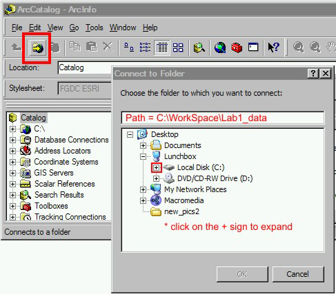
- Note that Shapefiles (such as Buildings_Shp) in Cal directory are only one file in ArcCatalog, but in Windows shapefiles actually consist of 4 or 5 files (shp, shx, dbf...).
- Right click lithics.csv and choose "To dBase (single)" to save out the CSV file in a format that we can use in Joins and Relates in Arcmap.
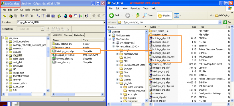
III. Organizing data in ArcMap 9.2
ArcMap is where most of the data exploration, analysis, and mapping occurs. The same toolbox functions are available in Arcmap as in ArcCatalog. In fact, we could have done the above step (CSV -> DBF) in Arcmap but I wanted you to see what ArcCatalog looks like.
- Open ArcMap by double-clicking on Campus_UTM.mxd (map document).
A. View UC Berkeley data
- Zoom and pan to ARF area using Arcmap Tools.
For your information, I got the underlying imagery and DEM data from the USGS Seamless Server.
B. Add Locs.csv file to map document
- why doesn’t it show in the Display tab, only in the Sources tab?
Answer: because only spatially referenced data appears in the Display tab.
C. Right click on Locs.csv and choose Add XY Data…
- Add X, Y, and choose Coordinate System (Projected, NAD83, UTM Zone 10 North)
D. These data become Events, which are spatial but they are not Shapefiles. They must be saved out to Shapefiles.
- Right click Locs_event > Data... > Export Data > Shapefile...
IV. Summarize in Arcmap
A. Relate (Or Join?) Lithics.csv to Locs shapefile
|
- right click on Locs > Joins and Relates... (choose Relate... from the menu shown at the right) |
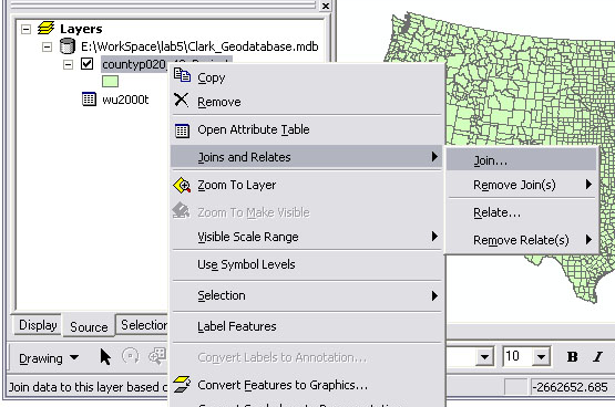 |
- The structure we're looking at using is called a One-to-Many (1:M) relate.
This is a powerful way to organize your data and explore relationships. To move between tables you use selections (highlight the rows in Blue) and then click Options... > Related Tables... > relate-name.
The associated records are now Selected in the related table using a LocID number. In this case "1004" links the two selections.

You can do a number of operations to your selection in Arcmap. Any analysis will apply only to the selected records, and if you want to copy just these records out into their own file at any point you can choose Export Data... and only those records will be exported to a new table or Shapefile. While it's tempting to export things out to their own files, it is a static and conservative approach. It is more flexible to structure your data dynamically through these kinds of relates because updates in one table cascade through your data sets. However, there are limitations to relates when it comes to graphical representation and thus we're going to have to move our data out of the Related Tables structure below.
One thing you can't do through a 1:Many Relate is Symbolize your Map data. In Arcmap 9 you still have to think about how to squash these down (Pivot and Summarize) to join the Many side of the relationship together into a 1-1 Join. We will now do just this kind of mapping process.
V. To link uniquely to Locs we must use a Pivot Table and then Summarize
A. Pivoting to match artifact data with spatial positions and then mapping those data.
Open ArcToolbox (Window menu > ArcToolbox).
Data Management > Table > Pivot Table
Note: You’ll want to use Input Fields: LocID, Pivot Field: Lit_Mat, Value: Wt_g
Licensing issue: PivotTable is only available with ArcInfo, the highest licensing level, not Arcview or ArcEditor. A much more powerful PivotTable function is available in Excel 1997 and higher. Archaeologists will benefit from learning the Pivot Table functions in Excel and learning this tool is highly recommended. If necessary, see this brief Excel Pivot Table tutorial.
The resulting table has Lithic Materials as columns across the top and weight (gr) in each cell, which is what we want, but if you look at the LocID values you'll see that some of them (e.g., LocID = 1004) are still repeated many times. In other words, we still have a 1-Many relationship issue. To condense these on LocID to a 1-1 relationship (a join) we'll use the Summarize command.
|
Summarize: You still have multiple rows for a single LocID in some cases (a 1:Many relationship). We can collapse these into a single row per LocID by Summarizing on LocID.
Next, in Arcmap Attribute Table – Field Calc add up all Lithics in each Row -> Sum_Wt - Field Calculator is also where Cut/Copy/Paste occurs, and calculations.
Finally, we must use a Join to link these results to spatial locations.
|
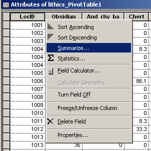 |
B. Symbolizing based on these values.
Open the Attribute Table for Locs and scroll to the right. Note that the results of your Sum operation (summary weights per Material Type per Location) are available in new columns added to the right of your Attribute Table. You can make maps using those values.
- Right click on Locs and choose Properties... then choose the Symbolize... tab.
- Choose Quantities and Graduated Symbols. Here you can choose Sum_Obs to generate symbols relative to the Sum of Obsidian Weight per context.
- Also try Charts > Pie Charts symbology. Here you can chose multiple material types and symbolize by the proportion of each pie in the chart.In this example you can see that the Chert (pink color) makes up most of the pie chart and Chert from that location weighed 144.9 gr.

VI. Convert to Raster for further mapping and analysis
A. How to generate contour lines based on these data?
You must interpolate to raster (GRID) then create contours and other surfaces. Rasters are generalized statistical surfaces, especially useful for studying patterns and representing trends. These can be viewed as 3D models in ArcScene or ArcGlobe, or used for mapping isolines (contours)
Rasters are cell or point based data. In terms of graphics software, think of Photoshop (pixel or cell based) as opposed to Illustrator or Corel Draw (vector based, object oriented). ESRI GRID is a proprietary Raster format.
Everything having to do with GRID (Raster) in ArcGIS is under the Spatial Analyst Extension or Toolbar. Make sure you installed Spatial Analyst and that both the Tools > Extension tool bar are turned on for these functions.
- Spatial Analyst Toolbar > Interpolate to Raster > Inverse Distance Weighted (IDW) with these values...
- Input settings: Loc, Z Values: Locs_Sum_Obs, Cell Size: 1, Output Raster: simple filename
Convert GRID raster to contours
- Spatial Analyst > Surface Analysis > Contour....
Rasters are good for statistical analysis based on a cell based model of spatial phenomena.
The following graphic shows a GRID of obsidian density (per m2) and contours (interval = 10) on top of that GRID.

VII. Distance calculations
Note that vector-based spatial analyses like point pattern analysis are available under Arctoolbox under Analysis
Many distance calculations result in Raster GRID surfaces. These include Euclidean Distance calculations and Cost Surface Analysis.
How do I calculate the distance from the edge of a polygon to a points scatter (Locs)?
1. Lets choose a polygon in the building (such as the outline of Wurster Hall in the UCB Ref data).
- use the Selection arrow to choose Wurster Hall visually.
- In the ArcToolbox under Spatial Analyst > Distance > Euclidean Distance...
- Choose Buildings.shp as the input layer
- Choose Locs as the Distance layer
- Name the output raster "Wurster_to_Locs"
2. To calculate the actual distance, use the Summarize Zones... command under the Spatial Analyst toolbar
- Summarize Zones where the Zones are Locs.shp and the Values Raster is "WUrster to Locs" GRID.
- Choose to Join the output to the Locs table. The output will contain the distance (in meters) for each record in Locs (each GPS collection location) to Wurster Hall.
VIII. Cartographic output
A final map was produced by going from Data Mode to Layout Mode.
- Click on the Layout button on the bottom of the map pane.This small button is important because it allows you to switch between between Arcmap data layout mode and page layout mode.
- Add Legend, Scale Bar, North Arrow.
- Right click Layers... > Properties, then click Grid tab. Choose Measured Grid to add UTM grid.
PDF files are a good way to distribute maps from Arcmap.
- users can zoom in on PDF files, and vector file format is preserved (unlike JPG, TIFF, PNG).
- output a high resolution PDF (400-600 dpi) to distribute and print.
- output an EPS file to place in a Word Processor for high res output to a Postscript device or PDF. EPS is a good format to use for map figures included in reports (theses) distributed as PDF or for publication.
Workshop 2009, No. 1 - Viewshed and Cost Distance
Archaeological Research Facility at UC Berkeley
PRACTICAL WORKSHOP
Working with Archaeological data in Arcmap 9.2:
A brief tour of Viewshed and Cost distance functions
Friday Mar 5, 2009
by N. Tripcevich
Overview of Workshop
Viewshed AnalysisA viewshed is the area of land visible from a given location. While single-site viewshed analysis is not substantially better than personally standing at a location and looking around, the computational advantage of viewshed analysis (or cumulative viewshed analysis), arises when you can investigate general trends of site intervisibility across dozens or hundreds of archaeological site locations. |
 |
We can pose questions such as "What archaeological sites or landscape features are visible from a given location?", "Were sites located so as to be able to monitor a greater number of other sites during times of conflict?", and "Does a particular type of archaeological site have a larger than average viewshed?". Uncertainties about past vegetation (was there a forest to block the view?) limit the applicability of viewshed analysis in some regions of the world, however it remains a useful tool for bringing our cartographic knowledge of archaeological settlement patterns closer to the subjective experience of ancient peoples and their landscapes.
Cost-Distance Analysis
- We're using Point vectors (shapefile or Geodatabase) with one nominal attribute that, in our case, differentiates the locations into three time periods.
- You need a topographic surface (DEM) in the same coordinate system and projection as the point layer.
- Most importantly, these layers need to be projected into a coordinate system based on meters or feet (such as UTM or State Plane), and not based on Degrees (Latitude/Longitude) because distance calculations cannot be correctly performed in angular units of degrees.
Sources of DEM data: local government mapping agencies maybe your best source of DEM data. If local agencies do not provide DEM data you may use SRTM data (30m resolution in the US, 90m internationally), CGIAR serves SRTM data with the holes filled. The example provided here is based on 30m ASTER DEM data in Peru using the UTM coordinate system.
I. Viewshed Analysis 2009
This exercise will demonstrate two types of viewshed analysis.The first is a single site Viewshed, and the second is a general measure of visibility or exposure.
To begin with, please download and unzip the following dataset: 2009_View_Cost.zip (2mb).
Place the data in a directory under C:\ (not in My Documents) so that the path is simple and has no spaces. You might use
C:\gis_data\
Note: these data are derived from my dissertation data but the attributes have been altered for this workshop.
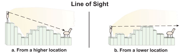
1. Setup the project in Arcmap.
- Add the Sites shapefile.
- Add the Hydro_lines100k Shapefile.
- Add the 30m ASTER DEM from \dem\
Look at the coordinates in the lower right corner. Is this in UTM or in Decimal Degrees? With Viewshed analysis linear units (like Meters) are necessary to accurately calculate distances.For more information on projected and unprojected data in GIS see the ESRI Coordinate Systems help and Peter Dana's online tutorials.
Look at the Attribute table for Sites. I won't explain the attributes here (see other labs in the GIS and Anthropology course) but the ARCHID field is a unique ID field for each feature in this Shapefile.
We'll use the "Period" field to differentiate sites from different time periods in this study.
The values are
- Formative (2000BC - AD400)
- MH Middle Horizon (AD400-AD1100), there are no MH sites in this dataset
- LIP Late Intermediate Period: (AD1100-AD1476)
- LH Late Horizon (AD1476-AD1532)
Note that the last attribute "View_Code" is a numerical representation of the Period field.
2. How do we control the viewshed calculation?
Please see the explanation on this webpage: ArcGIS Help - Viewshed
The optional viewshed parameters are SPOT, OFFSETA, OFFSETB, AZIMUTH1, AZIMUTH2, VERT1, and VERT2. These attribute fields will be used by the Viewshed function if they are present in the feature observer (Sites) attribute table.


The only two attribute variables we are concerned with at this point are OFFSETA (height of viewer) and RADIUS2 (the maximum radius of the viewshed calculation).
The viewer's eyes are at 1.5m above the ground, and we want to know the visible area within 5 km of each site.
In order to setup the analysis we need to add these values to fields in the Sites attribute table.
- Make sure nothing is selected in Arcmap [Selection menu > Clear Selected Features].
- Open the Attribute Table for the Sites layer [Right click Sites layer > Open Attribute Table].
- Choose Options (at bottom of table) > Add Field…
- Call it OFFSETA, make the type FLOAT and the Precision 2 and the scale 1.
Precision sets the number of significant digits, while the Scale is the location of the decimal point from the right side of the value. These settings allow the field to store "1.5".

- Use Calculate Values... command to put 1.5 in the field for the whole table. [Right-click field header OFFSETA > Field Calculator
- Choose Add field... again
- Call it RADIUS2 and leave it as the default: Short Integer
Question: Since we want to limit the value of the view to 5 km, what should the value be in that goes in this field? What are the spatial units of this map in the UTM coordinate sys?
Answer:You can use Calculate Values... command to fill the RADIUS2 field with the value 5000 (meters) all the way down.
3. A quick viewshed analysis
For the next step you need to make sure your Spatial Analyst extension is turned on [Tools > Extensions > Spatial Analyst] and that the Spatial Analyst toolbar is visible [View > Toolbars > Spatial Analyst]
- Make sure nothing is selected in Arcmap.
- go to Spatial Analyst toolbar > Surface Analysis > Viewshed…
Input: Colca_Aster
Observer Points: Sites
Use the defaults [Z=1, Size=30m] and allow the output to go into Temporary.
Look at the result. What is this showing? Is this informative?
Put the Colca_HS (hillshade) layer above the Viewshed output at 60% transparency:
- Drag Colca_HS above the Viewshed layer in the Layers list.
- Right click Colca_HS and click Display tab.
- Enter 60 in Transparency field.
This help you to visualize what is happening. Note that none of the Sites are within 5 km of the border of the DEM so there are no "Edge Effects" from the analysis running off of the edge of the DEM.
4. Viewshed analysis - differences between time periods
What is missing from the previous analysis was a theoretical question guiding the inquiry. Obviously, you can select a single site and run a viewshed and find out the resulting area. But how is this different from just going to the site and looking around and taking photos?
You could also select a line and find the viewshed along a road, for example. However, GIS has made it easier to pursue interesting questions by looking at general patterns with larger datasets. This is where computers give you an advantage because you're repeating many small operations.
We want to answer questions such as:
- How do viewsheds change based on the type of site that is being evaluated?
- Are Late Intermediate sites more or less likely to be constructed such that they can view one another?
We can calculate separate viewsheds for each group of sites in our table by manually selecting each group from the Attribute Table and running the viewshed calc. Exploring viewsheds for different subsets of the Sites file is a good application of the ModelBuilder feature in ArcGIS, however we won't be using it in this workshop (see this Yale Library GIS workshop for a Model Builder viewshed tutorial).
1. Calculate viewshed for each major group:
We will manually select groups of Sites by Attribute and compare the viewsheds between them.
- Open the Sites Attribute table, Sort Ascending on the "Period" field.
- Select only the Formative sites
- Use Spatial Analyst > Surface Analysis > Viewshed…
- This time change the "Output Raster:" field to be "Form5km" and save it to the viewshed folder.
- MAKE SURE the INPUT SURFACE IS COLCA_ASTER (it will default to the wrong GRID file!).
- Repeat the above process two more times with LH and LIP, calling the output GRID files LH5km and LIP5km respectively. Turn these three layers on and off and investigate their respective Visible areas.

5. Consider the implications of your results carefully and bring them to other software.
The results of viewshed analysis are a bit of a puzzle to think through. Consider the issue of intervisibility: are you assuming that everyone who is "in view" can in turn percieve their viewer? What about camouflage, or hiding behind hilltops?
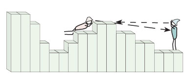 A non-reciprochal viewshed |
The size of the target, the target against a background, the air quality, and visual acuity of the viewer are all factors. Many such assumptions should be considered before deriving strong conclusions from these analyses.
Numerically, we can explore these results and you may want to bring the data out of ArcGIS for statistical analysis. First, have a look at the output GRID Attribute table for the Form5km GRID file. The VALUE field indicates how many of the sites can view a given cell, and the COUNT field indicates how many cells fall into that category.
In other words, in Form5km GRID the VALUE = 3 row shows that 1823 cells are visible from 3 sites and 88 cells are visible from all 4 formative sites.You can export these Attribute Table data to a comma-delimited Text file by going to the Options... button at the bottom of the window and choosing Options > Export... and Text format.
Analyses of Results
Alternately, instead of comparing between time periods you could use Site Type field designation to evaluate the viewsheds of "Pukaras" versus "Settlement" site types (for LIP sites only). Unsurprisingly, Pukara sites have much larger viewsheds.
Zonal Statistics
An important tool for analyzing geoprocessing results like Viewshed is the Zonal Statistics tool. Basically, this tool allows you to derive results from evaluating data in Vector form against data in Raster form. In this case, we can investigate patterning in viewsheds by time period such as "How many Formative sites fall in raster 'zones' visible from LIP sites (LIP viewsheds)? Contemporaneity issues aside, this allows us to look at settlement pattern changes.
Procedure:
Select all the Sites from the Formative using the Attribute Table values.
Spatial Analyst menu > Zonal Statistics...
Zone dataset: Sites
Zone field: ArchID
Value Raster: Viewshed of LIP sites
Check "Join output table to zone layer"
and put the Output table in your 2009 Workshop directory.
 The output from this analysis is a table with a row for each Formative site in your selection (so that the tables can be joined), and then with columns showing the values of the raster underneath those selected site locations. In this case, the values are mostly 0 which shows you numerically that despite the high viewsheds of the LIP, the Formative settlement patterns was quite different.
Zonal Histogram is a new tool to generate a frequency plot using the symbology of your Raster layer.
Other analyses:
We could calculate the number of cells in view per site, or other types of averages.
For example, in the Sites Attribute table there is a SiteType field that indicates that some of the LIP sites are Pukaras. These are hilltop defensive structures that have notoriously good views. We could determine the degree of intervisibility between LIP pukara sites numerically.
However… there's a problem. The problem lies in the bias in our sample because sites tend to aggregate around resource patches or other features. In these areas our dataset has high "intervisibility" because it reflects aggregation within the 5km buffer. In other words, many sites can see a particular cell in those situations where there are many sites in a small area!
We can get around this problem by calculating viewshed for random site locations as representative of "typical" views in the area. We will then compare our site views against this typical viewshed. This is called a Cumulative Viewshed Analysis and there isn't time to do that this workshop.
Viewshed - A few relevant references
Lake, Mark W., P. E. Woodman and Stephen J. Mithen
1998 Tailoring GIS software for archaeological applications: An example concerning viewshed analysis. Journal of Archaeological Science 25(1):27-38.
Llobera, Marcos
2003 Extending GIS-based visual analysis: the concept of visualscapes. International Journal of Geographical Information Science 17(1):25-48.
Ogburn, Dennis E.
2006 Assessing the level of visibility of cultural objects in past landscapes. Journal of Archaeological Science 33(3):405-413.
Tripcevich, Nicholas
2002 Viewshed Analysis of the Ilave River Valley. Master's Thesis.
Tschan, André P., Wldozimierz Raczkowski and Malgorzata Latalowa
2000 Perception and viewsheds: Are they mutually exclusive? In Beyond the map: Archaeology and spatial technologies, edited by G. R. Lock, pp. 28-48. IOS Press, Amsterdam.
Wheatley, David
1995 Cumulative Viewshed Analysis: a GIS-based method for investigating intervisibility and its archaeological application. In Archaeology and GIS: a European perspective, edited by G. Lock and Z. Stancic. Routlege, London.
Wheatley, David and Mark Gillings
2002 Spatial technology and archaeology: the archaeological applications of GIS. Taylor & Francis, London ; New York.
II. Cost-Distance 2009
II. Cost-Distance Analysis
Most cartographic distance calculations are performed in coordinate systems such as the metric Universal Transverse Mercator (UTM) where space is evenly divided into equal-sized units. In practice, however, people often conceive of distances in terms of time or effort. In mountainous settings the isotropic assumptions of metric map-distance calculations are particularly misleading because altitude gained and lost, and other obstacles such as cliff faces, are typically not factored into the travel estimate. Cost-distance functions are a means of representing such distances in terms of units of time or caloric effort.
In this exercise we will use an algorithm, one based primarily on slope from a topographic surface, to derive both an optimal route across that surface (Least-cost Path) as well as estimated time to cross that surface. Please see the ESRI manual on Path-distance and for a more thorough explanation see the general Cost-distance explanation as well. Here we are performing a pathdistance calculation using a customized cost function that reflects empirical data published by Tobler, 1993. Tobler's function estimates time (hours) to cross a raster cell based on slope (degrees) as calculated on a DEM.
I have converted data provided by Tobler into a structure that ArcGIS will accept as a "Vertical Factor Table" for the Path Distance function. In other words, ArcGIS makes these sorts of calculations easy by allowing you to enter customized factors to the cost function.
A. ISOTROPIC TIME ESTIMATE
1. Distance and time estimates based on 4 km/hr speed on an isotropic surface
This exercise begins by calculating distance and estimating time done in the old fashioned way, assuming a flat surface, as you would do on a map with a ruler.
We will begin by creating an isotropic cost surface and then generating 15 min isolines on this surface.
- Download the file [ViewCost.zip] and load the files into Arcmap.
- Open the attribute table for Sites and choose the row with the value ArchID = 675.
Hint: Sort Ascending ArchID column, and hold down ctrl button while you click the left-most column in the table for those two rows.
- Go to Toolbox > Spatial Analyst Tools > Distance > Euclidean Distance [Make sure Spatial Analyst extension is turned on under Tools > Extensions]
Input Feature: Sites
Output Dist Raster: EucDist_Site1
[click folder and save it in the same DEM folder]
Output cell size: 30
Leave the other fields blank.
- Before clicking OK click the Environments… button at the bottom of the window.
- Click the General Settings… tab and look at the different settings. Change the Output Extent field (General Settings) to read "Same as layer colca_aster".
2. Create raster showing isotropic distance in minutes
The output is a raster showing the metric distance from the site.
Let's assume for the purposes of this example that hiking speed is 4 km/hr regardless of the terrain, which works out to 1000m each 15 min.
-
To transform the EucDist_Site1 grid into units of time (minutes) we can perform a Spatial Analyst menu > Raster Calculator expression using this information:
15 min / 1000 meters = 1 min / 66.66 meters
To construct that equation in Raster Calculator to get the raster to display in units of minutes we would divide the distance raster by 66.66. Built up the equation like so:
Double click EucDist_Site1 layer, click / button, then type in 66.66
If you've done it right the output raster (Calculation) will range in value from
0 to 204.897
- When you have this raster right click and choose "Make Permanent…", and call it "isodist_min". Remove the Calculation grid layer and add this "isodist_min" grid to your project.
3. Convert to isochrones
-
Create contours using the output raster with
Spatial Analyst toolbar > Surface Analysis > Contour…
- Then use the good Calculation raster as your input surface, choose 15 as your interval and use the defaults for the rest. Save the file out as "isochrone15" (click the folder to specify the target directory).
What do you think of the results of these lines?
The photo at the top of this webpage was taken facing south towards Taukamayo which lies in the background on the right side of the creek in the center-left of the photo. Taukamayo is the western-most of the two sites you just worked with in Arcmap. You can see how steep the hills are behind the site and on the left side of the photo you can see the town of Callalli for scale. Clearly the land is very steep around the site, especially in those cliff bands on the south end of the DEM. There are also cliffbands on the north side of the river but the river terrace in the foreground where the archaeologists are standing is quite flat.
B. ANISOTROPIC TIME ESTIMATE USING PATH DISTANCE
1. An algorithm is needed to convert from Slope to Time
In ArcGIS the PathDistance function can be used to conduct anisotropic distance calculations if we supply the function with a customized Vertical Factor table with the degree slope in Column 1 and the appropriate vertical factor in Column 2. The vertical factor acts as a multiplier, and multiplying by a Vertical Factor of 1 has no effect. The vertical factor table we will use was generated in Excel and it reflects Tobler's Hiking Function by using the reciprocal of Tobler's function. This function was used in Excel:
TIME (HOURS) TO CROSS 1 METER or the reciprocal of Meters per Hour =0.000166666*(EXP(3.5*(ABS(TAN(RADIANS(slope_deg))+0.05))))
Thus for 0 deg slope which Tobler's function computes to 5.037km/hr, the result should be 1/5037.8 = 0.000198541
You can download the file that we will use for these values here.
Right-click ToblerAway.txt, choose"Save Link as..." and save it in the same folder as your GRID files (the reciprocal ToblerTowards.txt is used for travel in the opposite dirction, towards the source).
An abbreviated version of this ToblerAway file looks like this
|
Slope (deg) |
Vertical Factor |
|
-90 |
-1 |
|
-80 |
-1 |
|
-70 |
2.099409721 |
|
-50 |
0.009064613 |
|
-30 |
0.001055449 |
|
-10 |
0.00025934 |
|
-5 |
0.000190035 |
|
-4 |
0.000178706 |
|
-3 |
0.000168077 |
|
-2 |
0.000175699 |
|
-1 |
0.000186775 |
|
0 |
0.000198541 |
|
5 |
0.000269672 |
|
10 |
0.000368021 |
|
30 |
0.001497754 |
|
50 |
0.012863298 |
|
70 |
2.979204206 |
|
80 |
-1 |
|
90 |
-1 |
2. Pathdistance Calculation
Once again select from the Sites attribute table the locations with ARCHID values of 675.
Type 80,000 in the scale field at the top toolbar and position the selected site in roughly the middle of the window
Go to ArcToolbox > Spatial Analyst Tools > Distance > Path Distance...
- Input: Sites
- Output: aniso_hrs1 [click the folder and navigate to (on these computers) the directory called D:\arch_workshop2009\ so the Path should read: D:\arch_workshop_2009\aniso_hrs1 ]
- Input cost:<blank>
- Input surface: colca_aster (our 30m DEM)
- Output Backlink raster: aniso1_bklk [put it in D:\arch_workshop_2009\ ]
- Open the "Vertical factor parameters" field
- Input Vertical Raster: colca_aster
- Vertical Factor: Table (scroll down to bottom of menu list)
- browse to find "Tobler_away.txt" on your hard drive
One more thing:You may get a geoprocessing engine error ... if so, remove this last step setting the Extent.
- Click "Environments..." at the bottom of the window
- Open "General Settings..."
- Set the Extent to "Same as Display"
3. Inspect your results carefully and convert units if necessary
Turn off the aniso1_bklk file so that you're viewing aniso1_hrs.
Why aren't the values larger? Recall what units the Tobler_Away function calculates?
We need to multiply this result by 60 because…. It's in hours.
-
Spatial Analyst toolbar > Raster Calculator…
[aniso1_hrs] * 60 ( note that you must have spaces between the variables and the operators in Raster Calculator.When in doubt, add a space ) - Right-click the Output Calculation and Make Permanent… Call it "aniso1_min" and save it into D:\arch_workshop_2009\
- Now generate 15 min contours on this layer as you did earlier and call the output "aniso15".
- Turn off all layers except Callalli_DEM", "Hydro", "isochrone15" and "aniso15".
- Do you see the difference in the two cost surfaces?
In this image the black circles are Isochrones incrementing by 15 minutes, while the background raster shows the Anisotropic distance calculation with red lines showing 15 min increments away from the site.
Using the Info tool (the blue 'i') you can point-sample distances along the way against the layer aniso1_min and isodist_min.
The differences between the two surfaces can be interesting
- Spatial Analyst > Raster Calculator...
- [aniso_min] - [isodist_min]
Symbolize the output raster using a Red to Blue gradient fill and look at the result. What are the high and low values showing?
PART C. GENERATING LEAST-COST PATHS BETWEEN SITES
Recall that you generated a Backlink grid called aniso1_bklk as part of the PathDistance calculation. We will now use that to calculate least-cost paths between the two sites and other sites in the region.
First, we need to generate a
- Add Backlink Grid to Arcmap called "aniso1_bklk".
Look at the results. Recall how Backlink Grids work (read about the Direction raster in the Help on Cost Distances), do the values 0 through 8 make sense?
Choose three sites from ArchID for this calculation
607, 611, 811, 837, 926
- Let's construct this selection in ArchID from the Attribute Table using Options button > Select by Attributes…
It should look something like this
[ARCHID] = 607 OR [ARCHID] =611 OR [ARCHID] = 811 OR [ARCHID] = 837 OR [ARCHID] = 926
- Now close the attribute table. You have four sites selected around the perimeter of the study area?
- Choose Toolbox > Spatial Analyst Tools > Distance > Cost Path…
Input Feature: Sites
Destination Field: ArchID
Input Cost Distance Raster: aniso_hours (use the hours not the minutes one)
Input Cost Backlink Raster: aniso_bklk
Note that the output is a raster GRID file. Wouldn't these be more useful as Polylines?
- Use Spatial Analyst > Convert > Raster to feature….
Input Raster: <the name of your cost paths file>
Field: Value
Geometry type: Polyline
Zoom in and explore the results with only the following layers visible:
Callalli_DEM, Hydro_lines100k, aniso_minutes isolines, and the cost-paths you just generated. Note how the paths avoid steep hills and choose to follow valleys, as you might do if you were planning to walk that distance.
Workshop 2009, No. 2 - Cartography with GPS field data in Arcmap 9.31
Archaeological Research Facility at UC Berkeley
PRACTICAL WORKSHOP
Cartography with GPS-derived Field Data in Arcmap 9.3.1
Friday Dec 4, 2009
N. Tripcevich
Data used in workshop (same datasets as used in previous workshops on this website):
- UCB GIS Reference data (UTM): Cal_GIS.zip (23 Mb)
-
ArcMap_Mapping_workshop_ucb.zip (15 Kb)
- Locs.csv: contains locations and UTM coords
- Locs.shp: shapefile version of the Locs.csv file
- Lithics_lab.csv – lithics lab analysis
- Ceramics_lab.csv – ceramics lab analysis
Note: These are not real data! These data files are based on real survey data from South America, but they've been relocated to false positions to an area where everyone is familiar with the geography and scale: the South-east corner of the UC Berkeley campus. The following exercise uses a table from Lithics lab analysis but the table from Ceramics analysis can be substituted.
I. Starting with Tabular data in Excel
Examining these in Excel
- Open, view the tables
- Look at field names in Excel, note that the column header (fieldnames) are simple text (ASCII, 8 char max)
- If necessary, export out as CSV (choose first CSV in Save As... File Format list)
- Close Excel
II. Bringing GPS point data into Arcmap
ArcMap is where most of the data exploration, analysis, and mapping occurs in the ArcGIS suite.
- Open ArcMap by double-clicking on Campus_UTM.mxd (map document).
A. View UC Berkeley data
- Zoom and pan to ARF area using Arcmap zoom and pan tools.
For your information, I got the underlying imagery and DEM data from the USGS Seamless Server.
B. Add Bing Maps background layer
- Click on this link (it will open in a new window)
http://help.arcgis.com/en/arcgisonline/content/index.html#/Using_Bing_Maps/011q0000001q000000/
- Click on the link that reads
Bing Maps group layer with all three services (LYR)
that file will download a .LYR file to your hard drive.- Navigate to the same directory as the Cal_UTM project and save it there.
- Click the Add Data tool and add that Lyr layer.
An LYR file is an ArcGIS file that contains symbology (defining its appearance in Arcmap) as well as a link to data sets that are either stored locally, on the local network, or on the internet. In this case, we are adding a layer referencing imagery hosted by the Microsoft Bing Maps (formerly Virtual Earth) servers.
Note: You will get a Coordinate System warning when you add this layer.
Normally these warnings are very important and you should not ignore them. In this case, however, we are going to ignore it (click the Close button).
The issue is that we are in the NAD1983 datum appropriate to North America whereas Bing Maps, being a global dataset, is in the WGS1984 datum for worldwide data. These two mapping datums were essentially the same 25 years ago when they were created, but they have drifted gradually apart, and now they differ by perhaps 1m. For our purposes today, this can be ignored.
- Click on the layer called "Bing Maps - Aerial with Labels" and drag it down so that it falls just under "cal_SE_30cm.tif".
- Uncheck the "cal_SE_30cm.tif" layer to turn it off -- look at how the imagery changes, recheck it and see that you can compare these two layers (the flicker test).
- Zoom waaaay in by drawing a very small box with the Zoom + tool and do a flicker test to compare the two layers.
Do they align well? You can use the ruler tool to determine their offset.
Note that the Bing layer appears to have some blurring - perhaps from compression algorithms.
D. Add Locs.csv file to map document
- why doesn’t it show in the Display tab, only in the Sources tab?
Answer: because only spatially referenced data appears in the Display tab.
E. Right click on Locs.csv and choose Add XY Data…
- Add East and North
Do you think Eastings belong as the X coordinate or the Y coordinate?
- choose a Coordinate System (use Projected, NAD83, UTM Zone 10 North).
F. These data become Events, which are spatial but they are not Shapefiles (you're almost there...)
They must be saved out to Shapefiles.
- Right click Locs_event > Data... > Export Data > Shapefile...
- Add the Shapefile to your map.
- Change the color of the dots by right-clicking the Layer Locs, going to Properties, and then choosing the Symbology tab. Click the dot under Symbol to change it.
- Choose a bright color that stands out against the imagery. You can choose a pre-defined symbol from the palette, but note that they're quite large. Choose a simple one that you like, but be sure to reduce the symbol size to 5.
GPS software frequently allows you to export directly to Shapefile so this may not be an issue.
If you map lines and polygons, you will probably need to be able to convert directly to Shapefile from the GPS software. However, it's possible to bring in polygons and polylines just using GPS points where the points are converted to become vertices in a larger geographical object.
III. Symbolizing data from the Attribute Table
All records in a Shapefile also appear in the Attribute Table for that Shapefile. In this exercise we will only briefly explore the Attribute Table but note that there are many important aspects to data management in archaeology that involve Attribute Tables (for example, handling One to Many relates). These were covered in more detail in my Spring 2008 ARF GIS Workshop, and that workshop uses these same practice data.
Here, the focus is on map production so we will not do much data manipulation.
A. Visit tabular data behind the map display.
- Right click on the layer name (Locs) and choose "Open Attribute Table".
Note that the LocID field is a unique identifier for each point, while the Descrip field contains nominal classes A, B, or C. Think of these as values that you might log in the field with your GPS.
The goal here is to make a map that displays those Descrip field classes in a useful way.
B. The simplest mapping: For display purposes, let's highlight all the "B" values
It's easy to select contiguous rows in the table and they appear highlighted in the map view. But how to get all the B values to be grouped together?
Currently it's sorted by LocID number.
- right click the field label Descrip and choose Sort Ascending.
- scroll down the list until you see the first B value
- click in the left-most column (a blank column) to select a row and hold the mouse button down and move down the list
- stop when you get to the end of the Bs.
Note that you can add and remove from your selection by holding down the "Control" key.
Move the Attribute table window out of the way and note that you can immediately see where the "B" classes are.
[As an aside, there are other ways to select by an Attribute, such as in the Options... menu at the bottom of the Attribute Table choose "Select by Attribute".]
- Unselect to revert back to the original state by going to the Selection Menu and choosing "Clear Selected Features"
C. Mapping symbology to Classes
The three classes in the Descrip column can be assigned specific symbols to make mapping clearer.
- Right-click the Locs layer and choose Properties...
- Choose the Symbology tab and select Categories from the left side list
- Under Value Field choose Descrip
- At the bottom of the window click "Add All Values".
Note the colors automatically chosen - are they distinct enough? You can uncheck the <all other values> row.
- Double-click the colored dots and choose different symbols for them, but make sure to make them small (size 4 or 5) as the default symbols are large.
As an aside: when you have many different values with sub-groupings you can aggregate them and manage them together by Shift-selecting here, then right-clicking and choosing Group. That isn't relevant here with our simple 3 class data.
There is a lot of power in Arcmap's Symbology system, and you can read more about it in the ESRI Online Help - Drawing Features and Symbolizing Categories (opens in new window). There are many ways to symbolize quantitative data as well -- something we don't cover in this Workshop.
D. Labeling points
Here we will label points by a field such as LocID
- Right click the layer Locs, go to Properties, and go to Labels
- Check "Label features in this layer"
- For Label Field choose LocID
- Click Apply (this leaves the window open) and look in the background -- what do you think?
The labels are a bit large and hard to read against the background.
- Click "Symbol...", Click "Properties..." then click the "Mask" tab.
- Select Halo and make it a size of 1.5
- Click OK, OK then Click Apply again.
Play with these settings until you get labels that are readable given the crowded points. Your current zoom level will determine the appropriate size.
VIII. Cartographic output
A final map was produced by going from Data Mode to Layout Mode.
- Turn off the Bing Maps and cal_SE_30cm.tif imagery layers. Background imagery is often distracting so we'll make a map using only topographic data from the ucb_hillshd and ucb_elev layers.
A. Layout Mode
- Click on the Layout button on the bottom-left of the map pane.This small button is important because it allows you to switch between between Arcmap data layout mode and page layout mode.
There is another Arcmap toolbar known as "Layout" that is used for panning and zooming on the page layout. This is an important distinction. The zoom/pan tools you used before will continue to move your overall data set. Experiment with Zoom on the two toolbars to learn how they differ.
Layout Mode is like Print Preview in some ways. You can see the border of your printed page, and you can determine how your map symbology scales to the page. The printed page size and dimensions are defined in File > Print and Page Setup...
- Zoom in so only one area data points is showing and choose the appropriate page direction (Portrait or Landscape) to fit them on a page.
B. Add Legend
- Choose Insert > Legend (only available in Layout mode)
- Use the arrows to move all Legend Items over to the left "Map Layers" except Locs and Buildings
- Leave the defaults for the rest of the legend.
- Under Legend Frame choose Border: 1 px, Background: white (scroll the list down)
- Leave defaults for the rest of the Wizard (next, next)
This legend is "Live" in that it is still connected to your data. If you change a symbol color, the legend will update immediately. This limits your ability to tweak the appearance, however, so often one ends up breaking the Live legend and converting it to graphics.
- Right click the Legend and choose "Convert to Graphics"
- Right click again and choose "Ungroup"
- Click on "Descrip" and press the Backspace key on your keyboard.
- Make other modifications if you wish.
Note that the Right-Click menu has useful tools when multiple objects are selected -- for example, "Align" (use is obvious) and "Order" to reach behind one graphic to reach another.
C. North Arrow and Scale
Cartographers will tell you that this is not a map without a north arrow and scale! It's just a diagram until these features are added to give it bearing and relative size in the real world.
The North Arrow is simple, just choose one you like and drag the corner to resize and position. Note that north arrow design can convey information about whether it refers to magnetic or true north.
The Scale bar often requires more tweaking.
- Choose a Scale bar by appearance. Resize it to the approximate space you have available.
How many divisions can you realistically include? Have it fall on a round number.
For example, if the scale bar goes to 8 units, change it slightly so it goes to 5 or 10.
If it goes to 10, lets adjust the subdivisions so they're appropriate.
- Right click and change Number of Divisions to 2, and number of subdivisions to 0.
- You may change the units from Meters to Km or Feet or Miles.
- Under the Numbers and Marks tab change the Frequency to "Divisions".
If you click Number Format you can adjust the size and spacing of numbers.
The scale bar simply takes some trial and error.
D. Including a grid or graticule
- Right click Layers... > Properties, then click Grid tab. Choose Measured Grid to add UTM grid or Gradicule to add the Lat/Long grid.
- It is often easiest to accept the defaults, see how the grid looks, then go back in and adjust it.
Common tasks include
- Turning the right and left labels to Vertical orientation. I often turn off the Bottom and Left labels because they can interfere with Figure captions in text.
- If you click "Additional Properties" in the Labels tab, then "Number Format" you can get rid of the Zeros after the metric distance (lower the number of decimal places).
- Under Lines you can turn off the grid lines by choosing "Do not show lines or ticks"
E. Output Formats
PDF files are a good way to digitally distribute maps from Arcmap.
- users can zoom in on PDF files, and vector file format and font quality is preserved (unlike JPG, TIFF, PNG).
- output a high resolution PDF (400-600 dpi) to distribute and print.
- output an EPS file to place in a Word Processor for high res output to a Postscript device or PDF. EPS is a good format to use for map figures included in reports (theses) distributed as PDF or for publication.
Workshop 2012 (Spring) - Mapping from Total Station data in Arcmap 10
This workshop walks through the process of generating maps from Total Station data in Arcmap. It is developed on ArcGIS 10.0 (sp4) and therefore tools and procedures may be different in other versions. The basic procedure involves saving the SDR file generated by SokkiaLink into a Point shapefile, then using the Points to Line and the Feature to Polygon tools in ArcToolbox Data Management Tools to convert these points into polygons. Finally we generate a map using these data.
Note that as an alternative method (for instance, if your Total Station download software doesn't generate Shapefiles) you may export your data as XYZ text file, preferably in CSV (Comma-separated values format) and then use the Add XY Data... command in Arcmap to convert those to an Event theme. Finally use Data > Export Data... to convert the Event theme to a Shapefile or GDB feature class.
Going from Points to Polygon Shapefiles from the Total Station
For the most efficient conversion, use the following methods while mapping with the Total Station
1. proceed around the features as if you were digitizing a perimeter line so that the integer field indicating the order of shots (1,2,3) can be used to connect the dots Arcmap. The Sokkia shows this integer as NAME and the values are logged in the OBJNAME field in output Shapefile.
2. Use the SOkkia CODE field to differentiate discrete themes in your map so that the polygons will not overlap in practice. Each CODE group you use will output into its own Point shapefile which, in turn, will be converted into lines and optionally merged into overlapping polygons. Thus, you can put all Hearths in one CODE "HRT" for example or separate them into HE1 and HE2 and HE3 CODES but then merge them into a single Polygon feature class or shapefile in the final step. This works provided the Hearths do not overlap in space or the polygons will be bisected.
On the bright side, it's possible to batch process much of this.
Points to Line
As mentioned, the shapefiles provided from SokkiaLInk are Point shapefiles which means that for each feature in the total station it is necessary to link the points in a "Connect-the-Dots" fashion with as a temporary Line feature before generating polygons. The sequence of shots in the Total Station is indicated by the OBJNAME field, and this field is used to indicate how to proceed around the points.
Open ArcToolbox (red toolbox icon in top toolbar) and ensure that it's docked to the right side of the Arcmap window. Browse to "Data Management > Features > Points to Line" tool. Clear your selection (with a selection only selected records will be included).
SINGLE FILE: Choose the POINT shapefile. Provide an output Line feature name or use the default which will output to your default GDB. Use OBJNAME as the Sort field and check the Close box.
BATCH MODE: Right click the Point to Line tool in the toolbox and choose Batch. Select all the Point files in question in the first column, in the second column provide output Line names. Skip to the Sort column (#4) and choose OBJNAME and for Close choose True. Note that Batch dialogs in Arcmap can be Cut/Pasted from Excel so if you have dozens of these it's better to build up a big operation Excel using the Fill Down commands and then Paste it into the Batch dialog. Note that you need enough empty rows so hit the + button many times to ensure you have the space for the Paste command.
How does the Output look? Assuming everything went without errors (green check mark in the result window) proceed by clearing the selection:
Under the Selection menu choose Clear Selected
Feature to Polygon
In the ArcToolbox just above the Point to Line tool you'll find Feature to Polygon. Convert each Line file to a Polygon. Note that you can aggregate multiple Line files at this point, so if you have Hearths HE1, HE2, and HE3 delimited as Line shapefiles you can create a single Polygon layer called Hearth. One important problem is that because the CODE attribute is the filename instead of an attribute, the CODE values (the labels distinguishing the Hearths) are lost.
I would like to find a way to avoid losing these attributes but one solution is to export to CSV as well and perhaps use a Spatial Join to pull the CODE values over as an attribute field.
| Attachment |
|---|
Workshop 2012, no. 2 - Cartography and field data in Arcmap 10
Archaeological Research Facility at UC Berkeley
PRACTICAL WORKSHOP
Cartography with GPS-derived Field Data in Arcmap 10
Thursday Dec 6 2012
N. Tripcevich
This is an introductory GIS walk-through where we will create a map from locational data starting with data in a spreadsheet table. Digital spatial data comes in a variety of forms from different instruments. Once your data is in metric units in tabular form (outside the scope of this workshop) the steps in this workshop can help you create a map in Arcmap in the Universal Transverse Mercator (UTM) coordinate system. As this is a very commonplace procedure today's workshop we will go through the steps for creating a publication-quality map from a set of points in a comma-separated value (CSV) table.
- Campus_basemap.zip (5.3mb) contains
-
- Arcmap 10.0 MXD file referencing two layers
- Building footprints shapefile
- Campus 1m Digital Elevation Model (DEM) and derived hillshading
Also included but not added to the MXD are three comma-separated tables:
- Locs.csv: contains locations and UTM coordinates
- Lithics_lab.csv – lithics lab analysis
- Ceramics_lab.csv – ceramics lab analysis
Note: These are not real data! These data files are based on real survey data from South America, but they've been relocated to false positions to an area where everyone is familiar with the geography and scale: the South-east corner of the UC Berkeley campus. The following exercise uses a table from Lithics lab analysis but the table from Ceramics analysis can be substituted.
Download both of these .zip files and unzip them into a directory on your computer. A folder on the desktop is fine. If you double-click the zip file in Windows it will open but be sure to drag the contents out of the zip file window in order to uncompress them.
While Windows offers partial support for Zip format I recommend installing 7-ZIP on your computer. It's an excellent free and open source program (GNU license) that is much more powerful than built in Zip support.
I. Starting with Tabular data in Excel
Examining these in Excel
- Open, view the tables
- Look at field names in Excel, note that the column header (fieldnames) are simple text (ASCII, 8 char max). Arcmap is very picky about the top row because these become the field headers in DBF format and therefore they MUST be under 12 characters with no spaces. For best results avoid using symbols such as % as well.
- If necessary, export out as CSV (choose first CSV in Save As... File Format list)
- Close Excel
II. Bringing GPS point data into Arcmap
A. Open Arcmap and load datasets
1. Find the Campus_UTM.mxd file and double-click to open Arcmap.
You will see a layer called "buildings" showing the ARF area of the UC Berkeley campus. The background data in brown is high resolution elevation data acquired from a campus repository in "Digital Elevation Model (DEM) format.
To find elevation data for other regions -- albeit at lower resolution data -- see the USGS Seamless Server for other regions in the US. For other countries try ASTER GDEM (30m) and SRTM (90M) datasets, or use national data sources in those countries.
2. Uncheck the DEM_1m layer
3. See other basemap data by going to File menu > Add Data > Add Basemap...
Look over the choices and select Bing Maps Hybrid.
Update: Microsoft now requires a free key for using Bing in Arcmap. Please see these instructions or use a different image layer basemap.
The other basemap choices are also useful: Topographic contains USGS topo sheets at a variety of scales in the US. OpenStreetMap sometimes contains very detailed road information in developing countries where the Bing maps road layer may be relatively empty. The Light Gray Canvas is a nice background for regional scale maps. Any of these layers can be faded into the background by Right-clicking the Basemap group > Properties > Display tab and changing Transparent to something like 50% (assuming the dataframe background is white).
B. Add Locs.csv file to map document
- why doesn’t it show in the Display tab, only in the Sources tab?
Answer: because only spatially referenced data appears in the Display tab.
C. Right click on Locs.csv and choose Add XY Data…
- Add East and North
Do you think Eastings belong as the X coordinate or the Y coordinate? Think about cartesian space.
- choose a Coordinate System (use Projected, NAD 1983, UTM Zone 10 North).
D. These data become Events, which are spatial but they are not Shapefiles (you're almost there...)
They must be saved out to Shapefiles.
- Right click Locs_event > Data... > Export Data > Shapefile... and call the file "Locs_shape"
Note that you've only saved one shapefile but this actually creates 4 to 7 files if you browse the folder in Windows with names like "Locs_shape.shp" and "Locs_shape.shx"
- Add the Shapefile to your map.
- Change the color of the dots by right-clicking the Layer Locs_shape, going to Properties, and then choosing the Symbology tab. Click the dot under Symbol to change it.
- Choose a bright color that stands out against the imagery. You can choose a pre-defined symbol from the palette, but note that they're quite large. Choose a simple one that you like, but be sure to reduce the symbol size to 5.
GPS software frequently allows you to export directly to Shapefile so converting from table CSV may not be an issue.
If you map lines and polygons, you will probably need to be able to convert directly to Shapefile from the GPS software. However, it's possible to bring in polygons and polylines just using GPS points where the points are converted to become vertices in a larger geographical object.
Arcmap can convert from Garmin GPX format and from Google KML/KMZ format under ArcToolbox > Conversion Tools > From GPS (GPX) or From KML...
If you want to skip this step II you can just download the Shapefile, unzip, and add to your project.
III. Symbolizing data from the Attribute Table
All records in a Shapefile also appear in the Attribute Table for that Shapefile. In this exercise we will only briefly explore the Attribute Table but note that there are many important aspects to data management in archaeology that involve Attribute Tables (for example, handling One to Many relates). These were covered in more detail in my Spring 2008 ARF GIS Workshop, and that workshop uses these same practice data.
Here, the focus is on map production so we will not do much data manipulation.
A. Visit tabular data behind the map display.
- Right click on the layer name (Locs) and choose "Open Attribute Table".
Note that the LocID field is a unique identifier for each point, while the Descrip field contains nominal classes A, B, or C. Think of these as values that you might log in the field with your GPS.
The goal here is to make a map that displays those Descrip field classes in a useful way.
B. The simplest mapping: For display purposes, let's highlight all the "B" values
It's easy to select contiguous rows in the table and they appear highlighted in the map view. But how to get all the B values to be grouped together?
Currently it's sorted by LocID number.
- right click the field label Descrip and choose Sort Ascending.
- scroll down the list until you see the first B value
- click in the left-most column (a blank column) to select a row and hold the mouse button down and move down the list
- stop when you get to the end of the Bs.
Note that you can add and remove from your selection by holding down the "Control" key.
Move the Attribute table window out of the way and note that you can immediately see where the "B" classes are.
[As an aside, there are other ways to select by an Attribute, such as in the Options... menu at the bottom of the Attribute Table choose "Select by Attribute".]
- Unselect to revert back to the original state by going to the Selection Menu and choosing "Clear Selected Features"
C. Mapping symbology to Classes
The three classes in the Descrip column can be assigned specific symbols to make mapping clearer.
- Right-click the Locs layer and choose Properties...
- Choose the Symbology tab and select Categories from the left side list
- Under Value Field choose Descrip
- At the bottom of the window click "Add All Values".
Note the colors automatically chosen - are they distinct enough? You can uncheck the <all other values> row.
- Double-click the colored dots and choose different symbols for them, but make sure to make them small (size 4 or 5) as the default symbols are large.
As an aside: when you have many different values with sub-groupings you can aggregate them and manage them together by Shift-selecting here, then right-clicking and choosing Group. That isn't relevant here with our simple 3 class data.
There is a lot of power in Arcmap's Symbology system, and you can read more about it in the ESRI Online Help - Drawing Features and Symbolizing Categories (opens in new window). There are many ways to symbolize quantitative data as well -- something we don't cover in this Workshop.
D. Labeling points
Here we will label points by a field such as LocID
- Right click the layer Locs, go to Properties, and go to Labels
- Check "Label features in this layer"
- For Label Field choose LocID
- Click Apply (this leaves the window open) and look in the background -- what do you think?
The labels are a bit large and hard to read against the background.
- Click "Symbol...", Click "Properties..." then click the "Mask" tab.
- Select Halo and make it a size of 1.5
- Click OK, OK then Click Apply again.
Play with these settings until you get labels that are readable given the crowded points. Your current zoom level will determine the appropriate size.
IV. Cartographic output
A final map was produced by going from Data Mode to Layout Mode.
- Turn off the Bing Maps. Background imagery is often distracting so we'll make a map using only topographic data from the ucb_hillshd and ucb_elev layers.
A. Layout Mode
- Click on the Layout button on the bottom-left of the map pane.This small button is important because it allows you to switch between between Arcmap data layout mode and page layout mode.
There is another Arcmap toolbar known as "Layout" that is used for panning and zooming on the page layout. This is an important distinction. The zoom/pan tools you used before will continue to move your overall data set. Experiment with Zoom on the two toolbars to learn how they differ.
Layout Mode is like Print Preview in some ways. You can see the border of your printed page, and you can determine how your map symbology scales to the page. The printed page size and dimensions are defined in File > Print and Page Setup...
- Zoom in so only one area data points is showing and choose the appropriate page direction (Portrait or Landscape) to fit them on a page.
B. Add Legend
- Choose Insert > Legend (only available in Layout mode)
- Use the arrows to move all Legend Items over to the left "Map Layers" except Locs and Buildings
- Leave the defaults for the rest of the legend.
- Under Legend Frame choose Border: 1 px, Background: white (scroll the list down)
- Leave defaults for the rest of the Wizard (next, next)
This legend is "Live" in that it is still connected to your data. If you change a symbol color, the legend will update immediately. This limits your ability to tweak the appearance, however, so often one ends up breaking the Live legend and converting it to graphics.
- Right click the Legend and choose "Convert to Graphics"
- Right click again and choose "Ungroup"
- Click on "Descrip" and press the Backspace key on your keyboard.
- Make other modifications if you wish.
Note that the Right-Click menu has useful tools when multiple objects are selected -- for example, "Align" (use is obvious) and "Order" to reach behind one graphic to reach another.
C. North Arrow and Scale
Cartographers will tell you that this is not a map without a north arrow and scale! It's just a diagram until these features are added to give it bearing and relative size in the real world.
The North Arrow is simple, just choose one you like and drag the corner to resize and position. Note that north arrow design can convey information about whether it refers to magnetic or true north.
The Scale bar often requires more tweaking.
- Choose a Scale bar by appearance. Resize it to the approximate space you have available.
How many divisions can you realistically include? Have it fall on a round number.
For example, if the scale bar goes to 8 units, change it slightly so it goes to 5 or 10.
If it goes to 10, lets adjust the subdivisions so they're appropriate.
- Right click and change Number of Divisions to 2, and number of subdivisions to 0.
- You may change the units from Meters to Km or Feet or Miles.
- Under the Numbers and Marks tab change the Frequency to "Divisions".
If you click Number Format you can adjust the size and spacing of numbers.
The scale bar simply takes some trial and error.
D. Including a grid or graticule
- Right click Layers... > Properties, then click Grid tab. Choose Measured Grid to add UTM grid or Gradicule to add the Lat/Long grid.
- It is often easiest to accept the defaults, see how the grid looks, then go back in and adjust it.
Common tasks include
- Turning the right and left labels to Vertical orientation. I often turn off the Bottom and Left labels because they can interfere with Figure captions in text.
- If you click "Additional Properties" in the Labels tab, then "Number Format" you can get rid of the Zeros after the metric distance (lower the number of decimal places).
- Under Lines you can turn off the grid lines by choosing "Do not show lines or ticks"
E. Output Formats
PDF files are a good way to digitally distribute maps from Arcmap.
- users can zoom in on PDF files, and vector file format and font quality is preserved (unlike JPG, TIFF, PNG).
- output a high resolution PDF (400-600 dpi) to distribute and print.
- output an EPS file to place in a Word Processor for high res output to a Postscript device or PDF. EPS is a good format to use for map figures included in reports (theses) distributed as PDF or for publication.
V. Interpolating Contour Lines
Turn off background layers except DEM_1m and ucb_hillshd (turn off ucb_elev). You can see how this is the shaded relief. Next turn off ucb_hillshd and turn on the ucb_elev DEM layer. This elev layer provides high resolution elevation data for generating contour lines. This is Raster data or continuous data and it consists of cells wherein every cell contains the metric elevation (use the Info tool, the blue "i" to query a point by clicking).
- To generate contours from the ucb_elev layer you must first make sure Spatial Analyst extension is turned on under Customize Menu > Extensions....
- Next use the tool ArcToolbox > Spatial Analyst > Surface > Contour ...
-
In the Contour tool dialog choose ucb_elev as the Input Raster, leave the Output file to the default location in default.gdb (incidentally I've found it's a good idea to output to default.gdb like a temp directory then copy data out from there into your proper directory structure for stuff you want to keep).
For contour interval choose 5 (meters) - Be patient, interpolating contours is a lot of work. Watch the lower-right corner of your Arcmap screen for a green status message and finally a green Check box.
- These can be labeled by right-clicking then Properties > Label tab then check Label and choose Contour field. Other settings in here like a 1.5pt mask (text style) behind the number and Placement Properties position > On-the-line... creates a more standard contour labeling method.
| Attachment |
|---|
Using this course material in your class
Please send email letting me know that you're planning to use these material with a link to the class, and that if you have suggestions or if you find errors then please let me know.
Nico Tripcevich
ARF , UC Berkeley
![]()
Courses referencing materials on this web course
- Anthropology, University of Virginia - Liz Arkush
- UC Santa Barbara Geog 176 (GIS) series
- University of Hawaii, Philip Page and John Vogler
- Pennsylvania State University, Nathan Craig
- UC Riverside, Scott Smith (ArqueoBolivia.com)
- University of Alabama, Steven Kosiba
- GIS in Anthropological Research , Stanford, Daniel Contreras
- UC Santa Barbara Anth 197/207: GIS in Anthropology, Javier Fernandez
- Harvard, Anth 2020: GIS and Spatial Analysis in Archaeology, Jason Ur
Origins of Complex Societies
Course surveying the theories and evidence concerning the origins of state-level societies in New and Old World. This course was designed and taught by N. Tripcevich as Anthropology 164 at UC Santa Barbara during the Winter quarter, 2007
Reading Questions
Reading Questions Webpage
Anth 164 - Origins of Complex Societies
Reading questions will be posted below, please hand in responses before class begins on date indicated.
Jan 10 - Wenke and Olszewski 2007, Chapter 1 (pp. 1-32)
Jan 10 - Wenke 2007, Chapter 1 (pp. 1-32)
1. Explain equifinality and why it limits the potential of historical reconstruction in archaeology.
2. How does the work of Karl Marx inform archaeological investigation of the origins of social inequality?
3. Describe is the connection between New Archaeology and Darwinian evolution.
Jan 12 - Wenke and Olszewski 2007, Chapter 2 (pp. 41-72)
You won't need to hand in these reading questions until class on Wed, Jan 17. Please note that you'll also have questions from the subsequent reading (Patterson, 1997) due then as well.
Answer two of the following three questions in a two part answer of at least 400 words.
1. The archaeological record informs models of the past human activity, describe two different examples from Ch 2 of evidence contributing to generalized models about human behavior in an anthropological sense.
2. How does a “problem-oriented” approach aid in making sure archaeological research advances our understanding of the past instead of just providing laundry lists of artifacts and ancient features?
3. What types of materials can be dated with the carbon-14 dating method, and how does dendrochronology contribute correction curves for more accurate carbon-14 dating results?
Jan 17 - Patterson 1997 article
Questions related to Patterson 1997 article in reader (it is also online).
Reading questions due in class on Jan 17. Answer two of the following three questions in a two part answer of at least 400 words.
1. Why is Patterson’s account of the English subjugation of the Irish during the 16th century interesting in light of the way that race and ethnicity were used to define “Progress” and “Civilization” by the British and Spanish Empires during the ensuing centuries?
2. During the 19th century, how were Mathusian and Darwinian concepts exploited by early anthropologists and state intellectuals to justify the ongoing genocide against indigenous peoples around the world (see also pp. 21-22 of Wenke book)?
3. Given the political and historical context presented in this essay by Patterson, can you describe a critical application of evolutionary concepts in New Archaeology (as you read in Wenke, pp25-27)? In your opinion, are evolutionary concepts more applicable to Paleolithic archaeology than to the study of more socially complex organization? What relevance do evolutionary concepts have to topics such as state collapse, in your view?
Jan 19 - Fried 1960, Wenke and Olszewski 279-292.
Jan 19 - Fried 1960 (in reader or online), and Wenke and Olszewski 2007 (pp. 279-292).
Answer two of the following three questions in a two part answer of at least 400 words.1. Describe the positions of prestige versus the persons capable of filling them equation that Fried uses to explain each of the different types of social organization in the article. Further, what role does inheritance have changes from one type of social organization to another?
2. Describe the spatial relationships between complex societies and their less-complex neighbors. What are the regional effects of stratified and state level societies, and how does resource distribution, roads, and other forms of interaction affect both complex societies and their neighbors?
3. What are the principal economic systems associated with each of the four types of social organization as described by Fried (1960) and by Steward (as reviewed by Wenke in pp. 279-292). Terms like reciprocity and redistribution are relevant here.
Jan 22 - Wenke and Olszewski 228-246
Theories concerning the origins of agriculture, reading questions. Wenke and Olszewski, pp. 228-246.
Answer two of the following three questions in a two part answer of no more than 400 words.
1. Discuss the logical fallacy of attributing human intentionality to food domestication. Is there a single linear process of domestication through plant / animal selection by humans that reflects the needs of sedentary communities in different parts of the world?
2. What are the major differences between the Natural Habitat Hypothesis examined by Braidwood and the model proposed by Brian Hayden? With Hayden’s model consider both the diet-change and the feasting (discussed later in the reading) aspects of his model.
3. What is the relationship between human fertility rates and food storage in anthropological models concerning early plant and animal domestication?
Jan 24 - Wenke and Olszewski 247-261
Origins of agriculture in the Old World, reading questions. Wenke and Olszewski, pp. 247-261.
Answer two of the following three questions in a two part answer of no more than 400 words. You can email the responses to me at tripcevich@anth.ucsb.edu, if you wish.
1. According to Chapter 6, what were the most important plant food sources found at sites in Egypt, the Levant, and the Yangtze Valley, and what are the earliest dates associated with evidence of the domestication of these crops?
2. Describe the link between Flannery's concept of food storage in the transition from "compound" to "village" in community architecture and the importance of storage and sedentism for human population growth (female fertility) that was described earlier in Chapter 6.
3. Which of the sites described in the reading provides evidence for trade in some subsistence goods, and why is trade potentially important among sedentary communities? What sort of trade goods are preserved or not preserved in archaeological sites according to the text?
Jan 26 - Wenke and Olszewski 262-270
Origins of Agriculture in the New World, Wenke and Olszewski 262-270
Answer two of the following three questions in a two part answer of no more than 200 words each.
1. What are the morphological changes associated with bean domestication versus the changes associated with maize? Compare this with the morphological changes in the rachis of wheat and barley in the process of south-west Asian plant domestication.
2. If the conditions that permitted plant domestication in Mesoamerica also occurred earlier during the Pleistocene, how does the model proposed by Richerson et al., mentioned earlier in the chapter, square with the evidence from Mesoamerica?
3. Discuss the extinct wild maize hypothesis versus teosinte debate.
Jan 29 - Haas 2001
Haas 2001 - Cultural Evolution and Political Centralization
Answer two of the following three questions in a two part answer of no more than 200 words each.
1. Haas describes a pattern in 19th and 20th century anthropology where researchers propose generalized and universal models of cultural evolution, and these models are then criticized by subsequent generations of anthropologists. Briefly describe the positions of late 19th century cultural evolutionists, their critics, and the mid-20th century evolutionists and their critics.
2. Consider two of the nine developmental paths at the end of Haas’ article in light of the selectionist and transformational views on evolution described earlier. Present a hypothetical example (you can be creative here) of each of these two showing the crux of the difference between a selectionist interpretation and a transformational interpretation.
3. If the contrast between the selectionist and the transformational approach represents a continuation of the conflict over the universal comparability between cultures in anthropology, explain in a brief but convincing way how the tinkerer model be used to reconcile these in one of the nine processes discussed at the end of Haas’ article. Please don't just use one of Haas' examples from the article but come up with one of your own.
Jan 31 - Wenke and Olszewski 565-583
Wenke and Olszewski 565-583 - North American Early Complexity
Answer two of the following three questions in a two part answer of no more than 200 words each.
1. What were the important crops in eastern North America during the earlier Woodland period, and how is the use of these crops reflected in the pottery?
2. Where are the domestic structures associated with the Adena, Hopewell, and Mississippian sites, and how do studies of domestic structures amplify our understanding of the renowned monuments.
3. Discuss the evidence for decline at Woodland and Mississippian sites.
Feb 02 - Wenke and Olszewski 583-595
Answer two of the following three questions in a two part answer of no more than 200 words each.
1. Compare the issue of the control of water between the polities in the eastern US and those discussed in the south-west.
2. Compare ceremonial architecture in the southwest and in the eastern US.
3. If maize, beans, and squash were the agricultural staples of complex societies in Mesoamerica why did the presence of these crops in the US southwest and east, together with other evidence of cultural contact with groups in Mexico, not result in greater social complexity north of the Rio Grande?
Feb 05 - Wenke and Olszewski 481-495
Answer two of the following three questions in a two part answer of no more than 200 words each.
1. What types of archaeological evidence from food and architecture among the Olmec result in them being categorized as a complex society, and when does this evidence occur?
2. Compare ceremonial architecture in Oaxaca at San Jose Mogote with architecture at Olmec sites.
3. Can evidence of household level trade provide archaeologists with evidence of status differences in Oaxaca society? Explain.
Feb 07 - Wenke and Olszewski 533-549
Answer two of the following three questions in a two part answer of no more than 200 words each.
1. Develop two examples of how contrasting environmental zones in the Andes affected the development of early complex societies in the region. What kinds of archaeological evidence can be used to inform on this issue?
2. How did monumental architecture develop through time in the region?
3. Compare the concept of "mother culture" in the case of Chavin de Huántar and the Olmec in Mesoamerica (from the previous reading) in terms of the role of art and ideology. Why are these arguments so often encountered, and what are the benefits and limitations of this perspective?
Feb 12 - Wenke and Olszewski 292-316
This is a relatively dense reading but give it close attention because this assignment sets the theoretical stage for the rest of the quarter. We will be returning to the themes in this reading. Answer two of the following three questions in a two part answer of 200 words each. 1. Compare two of the themes described in the pages 293-298 (Architecture, Mortuary evidence, Functional differentiation, or Settlement Patterns) with some of the nine processes listed at the end of the Haas 2001 reading (pp 16-17). 2. How does Marvin Harris' application of Marxian theory differ from that of Friedman and Rowlands? Be sure to read the passage from Marx as well (it relates well to this course, yet Capital was written in 1867!). Does Harris' approach have advantages for archaeologists in terms of empirical evidence? 3. Compare Trigger's synthesis with the models described in Brumfiel and Earle's approach.Feb 14 - Wenke and Olszewski 325 - 341
Answer two of the following three questions in a two part answer of no more than 200 words each. 1. Consider the evidence of ancient trade at Çatalhöyök in light of Brumfiel and Earle's three models of economic exchange (p. 315). 2. Discuss the architectural trajectory among the 'Ubaid in comparison with that of public architecture at another site from a previous reading in the Wenke & Olszewski book. 3. How do art styles and agricultural technologies coincide in initial cultural complexity in Mesopotamia? Consider this in light of one of the contemporary theories for early complexity presented in Chapter 7.Feb 16 - Wenke and Olszewski 341 – 362
Answer two of the following three questions in a two part answer of no more than 200 words each. 1. Describe the sequence of changes in settlement patterns in Mesopotamia from the earliest Neolithic settlements in the region (part of Wednesday's reading) through the Sumerian civilization. 2. What was the role of early writing in Southwest Asian complex societies. WHen did it develop and what can it tell us about these early states? 3. Describe the changing role of crafts specialists through time in the region.Feb 21 - Wright 1998 questions
Answer two of the following three questions in a two part answer of no more than 200 words each.
1. Describe the evidence Wright uses to differentiate domestic architecture from administrative buildings.
2. Describe the regional resource procurement argument for the Late Uruk expansion.
3. Where are seals found and what do they tell us about activities in the Middle Uruk versus Late Uruk times?
Feb 23 - Wenke and Olszewski 368-384
AnswerFeb 26 - Wenke and Olszewski pp 384-404
Based on your reading of the material in Ch 9 (Egypt), develop a compelling (but brief) theoretical argument for the origins of the Egyptian state. Consider the processes discussed in class, in Wenke & Olszewski Ch 7 (pp279-323), and those listed at the end of the Haas 2001 article. Please include explicit evidence from the second half of Ch 9 (Middle and New Kingdom Egypt). Note that there is a brief review at the end of chapter 9, but don’t just summarize that. Please come up with your own explanation. Comparisons with other early states are welcome. What is most convincing sequence to you and why? Please make your answer over 400 words.Feb 28 - Bard 1992
Answer two of the following three questions in a two part answer of 200 words each. 1. Compare the symbolic evidence from monumental architecture with the evidence from mortuary contexts in predynastic and dynastic Egypt as presented by Bard. 2. Describe the two principal categories of artifacts found as predynastic mortuary goods. What is Bard’s interpretation of the symbolic significance of these goods? 3. Does Bard’s article describe the development of a monolithic or a multifaceted role for authority in predynastic Egypt? Explain.Mar 2 - Wenke 495 – 524 (Mesoamerica). Outline and draft of bibliography due.
An outline for your final paper with a draft of a 20 item bibliography are due on Friday. For the bibliography please follow the American Antiquity format. This includes in text citation as follows (Smith 2000: 30-40), and a bibliographical format as described here. http://www.nd.edu/~sheridan/AmerAntiquitCitationStyle.pdf AnswerMar 5 - Joyce 2000
Mar 5 - Joyce 2000 Please answerMar 7 - Brumfiel 1983 - Aztec State Making
Please answer two of the following three questions in a two part answer of 200 words each. 1. What are the general characteristics of chiefdoms that are evident in the 13th and 14th century polities in the region? Which of these are significant in terms of the emergence of the state? 2. In the sequence explored by Brumfiel (1983) how did the tribute payments from lesser nobles to paramount chiefs change through time in the Basin of Mexico? Provide two examples. 3. According to Brumfiel (1983), were structural factors ultimately more important than ecological variables in the emergence and continuation of the Aztec state? Provide two examples to support your assertion.Mar 9 - Wenke and Olszewski 549-559, Stanish 2001
The Stanish article didn't make it into the reader
Stanish, Charles, 2001. The Origin of State Societies in South America. In Annual Review of Anthropology, pp. 41. vol. 30.
Please answer two out of the following three questions. 1. Definitions of “state-level society” vary but based on the recent literature in the region you’re focusing on for your final paper when does “state level” society emerge? Compare the attributes of the earliest state in your region with those described by Stanish 2001 (be sure to read the Comparative section at the end of the article). Which two early Andean state phenomena described by Stanish most closely matches elements of state-level society in your region and why (if your regional focus is on the Andes then compare between three Andean cultures). 2. What was the role of long distance exchange in the Andean state formation based on discussion in Wenke and Olszewski? 3. How does the evidence of labor organization and monumental architecture provide insights into Preceramic, Initial Period, and Middle Horizon formation in the Andes?
Mar 12 - DeMarrais, Castillo, Earle 1996 - Materialization of Ideology
Please answer two of the following three questions in a two part answer of 200 words each.1. Consider the region that you are focusing on for your final paper and provide two examples of the materialization of ideology at the beginnings of state-level society. What are the types of archaeological materials involved? Provide specific dates or time periods associated with these examples, if possible.
2. Compare ceremonial events described for either the Moche or the Inka with evidence from your chosen study area. What are the similarities or differences?
3. Describe the effects of scale on materialization of ideology as explained in the article. How do simple chiefdoms, complex chiefdoms/states, and empires differ in their degree of investment and in proportion in their "materialization of ideology"?
Mar 14 - Helms 1992
Answer two of the following three questions. 1. In your study region is there evidence of ceremonial or ritual specialists using associations with the exotic to bolster their status? Consider both movement through geographical space as well as and “vertical” domains as per Helms (1992). Provide two examples. 2. What are the archaeological ramifications of the conception put forward by Helms? Look through her article for material evidence that could be used to support/deny these assertions. 3. Explain how the phenomena of the development of an urban core and the expansion of empire into new territory during early state formation relates to the concepts in Helms’ article.Mar 16 - Flannery 1999
Last reading homework! Please answer two of the following three questions in a two part answer of 200 words each. 1. Develop an agency model for your region of interest based on the examples provided by the Bard, Joyce, Brumfiel, and/or Flannery articles. How would you accomplish this and support it with material evidence? Do you have more than iconographic imagery of people? The key is to link human volition with empirical, comparable archaeological evidence. 2. Are the elements of the agency critique discussed by Joyce in reference to Monte Albán consistent with those described as Agency by Flannery? Explain your answer. 3. Discuss two examples of objects and material evidence that were convincingly used by Flannery (1999) to support the link between the Process and Agency approaches that he develops in the article.Syllabus (Anth 164, Winter 2007)
The Origins of Complex Societies
Anthropology 164, UC Santa Barbara
| Nicholas Tripcevich | Email: tripcevich@anth.ucsb.edu |
| Winter Quarter 2007 | Office: HSSB 2049 |
| Class: M-W-F 10-11 AM, HSSB 2001a | Office Hours: M, W 11-12 or by appt |
| Class website: http://www.MapAspects.org/courses/origins_complex_soc | |
Course overview: This course combines archaeological theory and data in an examination of the origins of complex societies. We will look at different anthropological and archaeological approaches to the study of early civilizations. This course specifically focuses on theoretical models for the origins of agriculture and for socio-political changes that led up to the emergence of state-level society. The course employs a comparative method and we will examine the circumstances surrounding state-level organization in a number of regions including Egypt, Mesopotamia, Mesoamerica, and the Andes.
Evaluation format: Grades will be determined based on the following criteria. Written responses/participation: 30%, midterm: 30%, final paper: 40%.
Written responses are 400 word (1-2 page) responses to the reading questions in essay form. Reading Questions are posted online. These will be due at the beginning of each day of class. There will be 26 sets of questions assigned, and you can drop two of them so that 24 of these will count towards your grade.
The midterm exam will be an in-class exam, short and long answer questions. The final paper will be a 15 page research paper covering the emergence of the state in one of the regions covered in the course. You’ll need to find at least 20 bibliographical references for this paper (from the published literature, not from the Web) and an outline will be due several weeks before the end of the quarter.
Required Texts: Wenke, Robert J. and Deborah L. Olszewski (2007). Patterns in Prehistory: Humankind’s First Three Million Years. Oxford University Press, New York.
Additional readings will be posted to the web in PDF format. Printing these articles out (rather than reading online) is highly recommended and it can be done in a UCSB computer lab.
Plagiarism note: All students are expected to follow the university’s standards of academic honesty; there will be no tolerance for plagiarism. Plagiarism is a form of academic dishonesty that occurs when you present work belonging to someone else, either from a book, from the web, or from a classmate, as your own work. If you have questions about the proper way to cite another author’s work we can discuss it in class or during office hours.
Course schedule and reading assignments for Anth 164. Responses totaling at least 400 words will be due before class that day.
Wk 1, Mon, Jan 8 – Outline of the course, syllabus, readings, grading, introductions.
Wed, Jan 10 – Archaeological approaches: Wenke and Olszewski, Ch 1
Fri, Jan 12 – Archaeological data and inference: Wenke and Olszewski, Ch 2. Movie shown in class.
Wk 2, Mon, Jan 15 – UCSB Holiday, Martin Luther King day
Wed, Jan 17 – Civilization and its boosters, Patterson 1997 article.
Fri, Jan 19 – Typological approaches: Fried, 1960 article. Wenke and Olszewski, 279-292
Wk 3, Mon, Jan 22 – Theories concerning the origins of agriculture: Wenke and Olszewski 228-246
Wed, Jan 24 – Origins of Agriculture in Mesopotamia: Wenke and Olszewski 247-261
Fri, Jan 26 – Origins of Agriculture in the New World: Wenke and Olszewski 262-270.
Wk 4, Mon, Jan 29 – Political centralization: Haas 2001 chapter in From Leaders to Rulers
Wed, Jan 31 – Regional polities in North America: Wenke and Olszewski 565-583
Fri, Feb 2 – Regional polities in North America: Wenke and Olszewski 583 – 595. Movie
Wk 5, Mon, Feb 5 – Early complexity in Mesoamerica (Olmec): Wenke and Olszewski 481 - 495
Wed, Feb 7 – Early complexity in the Andes: Wenke and Olszewski 533-549
Fri, Feb 9 – Midterm Exam
Wk 6, Mon, Feb 12 – The evolution of complex societies: Wenke and Olszewski 292-316
Wed, Feb 14 – Mesopotamia: Wenke and Olszewski 325 - 341
Fri, Feb 16 – Mesopotamia: Wenke and Olszewski 341 – 362, Movie (Archaeology in Mesopotamia)
Wk 7, Mon, Feb 19 – UCSB Holiday, President’s Day
Wed, Feb 21 – Uruk states in Southwestern Iran, Wright 1998
Fri, Feb 23 – Egypt: Wenke and Olszewski 369 - 384
Wk 8, Mon, Feb 26 – Egypt : Wenke and Olszewski 384 - 397
Wed, Feb 28 – Ideology in Egyptian complex society: Bard 1992 article
Fri, Mar 2 – Mesoamerica: Wenke 495 – 524. Outline for Final Paper and draft of bibliography is due
Wk 9, Mon, Mar 5 – Monte Alban, Joyce 2000 article.
Wed, Mar 7 – Aztec state-making, Brumfiel 1983 article.
Fri, Mar 9 – Andean South America: Wenke and Olszewski 549 – 559, Stanish 2001 article
Wk 10, Mon, Mar 12 – Ideology, materialization, and power. Demarrais, Castillo, Earle 1996 article
Wed, Mar 14 – Long distance contact, Helms 1992 article.
Fri, Mar 16 – Process and agency in early states: Flannery 1999 article
Tues, Mar 20 –FINAL PAPER DUE before 10AM!